Archive for the ‘GDP – Gross Domestic Product’ Category

Residential Recovery Redux
February 25, 2014

Several key reports on the state of the housing market are due out this week (February 24 – 28, 2014), most of which will likely be negatively impacted by the colder and snowier-than-usual weather in much of the nation over December 2013 and January 2014. The data due this week include:

  • Case-Shiller Home Price Index for December 2013;
  • New Home Sales for January 2014;
  • Pending Home Sales for January 2014; and
  • Housing Contribution to gross domestic product (GDP) for Q4 2013.

The weather will eventually return to normal, but market participants are likely to be asking: Once the weather improves, will the housing data continue to feel the pinch of higher mortgage rates over the rest of 2014?

Solid Supports

The recent rise in mortgage rates — from just under 3.50% (for a conventional 30-year loan) in May 2013 to a recent reading of just over 4.25% — has led to widespread fears that the housing recovery will come to a grinding halt. Those fears appear to be overdone, in our view, as almost all of the factors supporting an ongoing recovery in housing remain in place. However, the rise in rates will likely slow the pace of the recovery somewhat.

In general, the housing market hit bottom in early 2009, and moved sideways between early 2009 and late 2011 before picking up momentum at the start of 2012 (please see “Location, Location, Location”). Until housing added 0.3 percentage points to overall GDP in 2012, housing construction (the most direct way housing impacts economic growth as measured by GDP) had not been a significant, sustained contributor to economic growth since 2005. The lack of participation from housing has been one of the main reasons for the sluggish economic recovery, along with the severe cutbacks in state and local governments.

When we last wrote in depth on the housing market in mid-2013, we forecast that “despite the recent rapid rise in rates, we still see housing making another significant (0.3 – 0.5 percentage points) contribution to GDP growth in 2013, as the positives driving the residential recovery more than outweigh the negatives.” Indeed, although the data are not final, housing contributed 0.3 percentage points to overall GDP growth in 2013. We expect housing to add between 0.2 and 0.3 percentage points to overall GDP growth in 2014.

Figure_1_-_2-25-2014

At this stage of the recovery, satisfying pent-up demand for housing rather than mortgage rates will likely be the bigger driver of housing. Later on, when the pent-up demand is sated, interest rates (and affordability) should be key drivers, along with housing supply and demand, the willingness of banks and financial institutions to make mortgage loans, the health of the labor market, and the housing PE (median sales price/disposable median income per capita).

Although we continue to hear and read comments from housing market “bears” that the housing market is already back in a “bubble,” housing (represented by residential investment) currently accounts for just 3% of GDP. This is half of what it was at the peak of the housing market in 2005 – 06, when housing accounted for more than 6% of GDP. Since 1980, housing, on average, has accounted for 5% of GDP. At just 3% today, housing’s share of GDP is not only half of the recent peak, but also well below the long-term average of 5%. But what about the other housing indicators?

Key Housing Indicators

Many, if not all, of the other housing indicators we watch (see below) also suggest ongoing recovery in the housing market in the quarters and years to come.

To be sure, while the sharp increase in mortgage rates since mid-May 2013 may have slowed the pace of gains in the U.S. housing market, our view remains that the housing market is still in the early stages of recovering from the 2006 – 09 bust that followed the decade-and-a-half (early 1990s through mid-2000s) housing boom that began to show severe cracks in 2007 and collapsed in 2008. The collapse in housing, in turn, was a major contributor to the financial crisis and the Great Recession of 2007 – 09. The housing market, along with many financial markets and global economies, is still feeling the after-effects of the housing collapse.

The health of the housing market can be measured in many direct ways (e.g., housing starts, housing sales, construction spending, home prices) and indirect ways (e.g., homebuilder sentiment, mortgage applications, foreclosures, inventories of unsold homes, mortgage rates, housing vacancies, lumber prices, prices of publicly traded homebuilders). The U.S. government and private sources collect and disseminate these data. A quick recap of some of these indicators is below.

Taking the Pulse of the Residential Recovery

  • Near-record housing affordability. Housing affordability, the ability of a household with the median income to afford the payments on a median priced house at prevailing mortgage rates, hit an all-time high in early 2013 before the big run-up in mortgage rates that began in mid-May 2013. The latest data point (December 2013) saw a 21% drop in affordability from the peak in January 2013. Despite the drop, affordability remains well above the long-term average, and it is some 70% higher than at the peak of the housing market in late 2005/early 2006. Rising incomes and the aftermath of the 20 – 30% drop in home prices nationwide between 2005 and 2009 will continue to support an elevated level of affordability. At this point in the housing recovery, pent-up demand will likely outweigh affordability as the main driver of housing demand.
  • The housing PE. Although not a perfect measure of the frothiness (or lack thereof) in the housing market, the ratio of the median sales price of an existing home ($197,700 in December 2013) to disposable personal income per capita ($39,726 as of December 2013) is one way to gauge the health of the market. Our infographic shows that while the housing PE”has moved higher in recent months, it remains well below average. Indeed, aside from the housing bust era (2007 – 11), the housing PE is the lowest it has been in more than four decades. This also suggests that the housing recovery remains in its early stages and is not in a bubble.
  • Inventories of unsold homes are tight. Although the inventory of unsold new and existing homes has moved up from a 32-year low since the start of 2013, inventories of unsold homes remain well below average. The official count of the inventory of unsold single-family existing homes (from the National Association of Realtors), along with the record-low inventory of new homes for sale, tells us 1.8 million homes are for sale. Depending on the data source cited (there is no “official” number for shadow inventory), the shadow inventory is in the 1.0 – 1.5 million range. The low inventory of unsold homes, particularly in areas where housing demand is the highest, supports ongoing improvement in housing construction and housing sales.
  • Supply of home mortgages. From the mid-1990s through late 2006, bank lending standards (down payment required, credit scores, work history, etc.) for residential mortgages were relatively easy. Coupled with low rates and rapid innovation in financial products backing residential mortgages, this easy credit helped to fuel the housing boom. The banking industry began tightening lending standards in early 2007, and continued to tighten for more than two years. Lending standards eased in 2009 and 2010, but remained more restrictive than they were in the peak boom years from 2004 to 2006. The latest survey (February 2014) reveals that bank lending standards for home mortgages are now back to “normal,” as defined by the 10 years between 1995 and 2005. It’s too soon to tell whether or not the tightening of standards in the latest period (February 2014) is the start of a new trend, or just a wiggle in the data. Either way, relatively normal mortgage lending standards are supportive of more gains in housing in the coming quarters. The Federal Reserve (Fed) compiles these data in the quarterly Senior Loan Officer Survey.
  • Demand for home mortgages. Consumer demand for mortgages remained muted during the first two-and-a-half years (early 2009 through late 2011) of the housing recovery, as consumers remained uncertain about prospects for home price appreciation and their own financial and labor market status. Between mid-2011 and mid-2013, an improving labor market, Fed actions to lower mortgage rates, and rising home prices drove consumer demand for mortgages to levels not seen since the early 2000s. But the rise in mortgage rates since mid-2013 has had a meaningful impact on demand for mortgage loans in recent quarters, and a further pullback in consumer demand for mortgages would be a threat to the sustainability of the recovery. The housing recovery is dependent upon low interest rates, but not necessarily the lowest interest rates. History shows us that if job and income growth can rise along with mortgage rates, the growth in housing can continue. The Fed compiles these data in the quarterly Senior Loan Officer Survey.
  • Demand for housing. Net household formation boomed in the mid- 2000s (2004, 2005, and 2006) but began to slow just prior to the start of the Great Recession in 2007. Unemployed new graduates were living with their parents or renting in large groups rather than moving into homes of their own for years after the 2007 – 09 recession. But that is ending. Over the past five years, (2009 – 13) household formations have stabilized, partially due to the better labor market, but also thanks to the echo boomers reaching their mid-to-late 20s. Although new household formation has slowed from its pre-Great Recession pace, it is still running at almost 1.0% per year. By early 2011, the gap between new household formation and new housing starts had never been wider. Soon thereafter, housing starts began to recover, and the healing in the housing market began to accelerate. However, there are still more than 18 million vacant homes — down from the peak of more than 19 million, but still well above the pre-Great Recession level of 14 – 15 million. This indicator continues to suggest that the housing recovery is still in its early stages. The U.S. Census Bureau collects the data on household formation and housing vacancies.

On balance, the sharp rise in mortgage rates that commenced in mid- May 2013 will likely slow the pace of housing activity that had accelerated noticeably between mid-2011 and mid-2013. Despite the rise in rates, most of the indicators we watch suggest that the housing recovery remains firmly entrenched. The pace (and sustainability) of the housing recovery will help to determine the pace of the overall economic recovery. We expect housing — as measured by the residential investment component of GDP — to make a positive contribution to overall GDP growth in 2014, as it did in both 2012 and 2013. However, it will likely take several more years before the national housing market is back to normal.

______________________________________________________________________________________________________________________________

IMPORTANT DISCLOSURES

The opinions voiced in this material are for general information only and are not intended to provide specific advice or recommendations for any individual. To determine which investment(s) may be appropriate for you, consult your financial advisor prior to investing. All performance reference is historical and is no guarantee of future results. All indices are unmanaged and cannot be invested into directly.

The economic forecasts set forth in the presentation may not develop as predicted and there can be no guarantee that strategies promoted will be successful.

Gross Domestic Product (GDP) is the monetary value of all the finished goods and services produced within a country’s borders in a specific time period, though GDP is usually calculated on an annual basis. It includes all of private and public consumption, government outlays, investments and exports less imports that occur within a defined territory.

______________________________________________________________________________________________________________________________

This research material has been prepared by LPL Financial.

To the extent you are receiving investment advice from a separately registered independent investment advisor, please note that LPL Financial is not an affiliate of and makes no representation with respect to such entity.

Not FDIC/NCUA Insured | Not Bank/Credit Union Guaranteed | May Lose Value | Not Guaranteed by any Government Agency | Not a Bank/Credit Union Deposit

Member FINRA/SIPC

The Employment Situation: Slow Climb Back
February 4, 2014

This Friday, February 7, 2014, the U.S. Department of Labor will release its monthly Employment Situation report. Though a lagging indicator of the economy, the report will likely garner plenty of attention from market participants, policymakers, politicians, pundits, the news media, and the public.

In December 2007 and January 2008, U.S. private sector jobs peaked at 115.7 million. The Great Recession and its aftermath saw the private sector economy shed 8.9 million jobs, and by February 2010, the private sector economy was down to 106.8 million jobs. Since then, the private sector economy has created 8.2 million jobs, and as 2013 ended, needed just under 700,000 net new jobs to get back to the pre-recession peak. We expect that to occur sometime in the first six months of 2014 [Figure 1].

Figure_1
Prior to the disappointing December 2013 employment report (released in early January 2014), which revealed that the private sector economy had created only 87,000 net new jobs in the weather-impacted month of December 2013, the economy had consistently been creating between 175,000 and 200,000 net new jobs per month [Figure 2]. We expect this pace of job creation to continue in 2014, with some variation around the trend due to fundamentals and weather. (See below for a discussion of weather’s impact on the January 2014 report.)

Figure_2

Weather and Revisions:  Sources of Uncertainty

The consensus of economists as surveyed by Bloomberg News is looking for a 190,000 gain in private sector payrolls in January 2014, after the 87,000 gain in December 2013. The range of estimates — the difference between the high and low estimate — is unusually wide for the January report. In recent years, the range of estimates has been around 120,000; for January’s report it is 200,000. The unusually wide range reflects the uncertainty around the impact of the weather on both the December 2013 and January 2014 reports, and also the revisions to the employment data made each year at this time.

While not all of the weakness in the December 2013 employment report was due to an unusually cold and snowy December, a sizable portion was. In January 2014, the population-adjusted average temperature was two degrees above normal. In December 2013, the same metric was two degrees colder than usual. The anomaly was even worse during the survey week (the week containing the 12th of the month) for the December 2013 employment report. It was six degrees colder than usual during the survey week in December 2013, and two degrees warmer than usual during the survey week in January 2014. In addition, the Department of Labor said that 273,000 people were “unable to work because of bad weather” in December 2013, the most for any December since 1977. This metric will be very closely watched again in January.

Another source of uncertainty surrounding the January 2014 employment report is revisions. In February of each year, the Labor Department releases revised data on the number of employees on payrolls. The revisions are based on new information gathered from businesses records and tax returns. Because of these revisions, the monthly changes in the payroll job count over the past year will be adjusted, but the pattern of employment is unlikely to change very much.

As noted in our Outlook 2014: The Investor’s Almanac, our view for this year is that U.S. economic growth will accelerate to 3.0% from the 2.0% pace seen in 2013. We expect both the federal government’s lifting of fiscal drags and increased state and local government spending to boost economic growth this year. In all of 2013, state and local government spending subtracted a small amount (0.02 percentage points) from gross domestic product (GDP) growth, but all of that drag occurred in the first quarter of 2013. By contrast, state and local governments added 54,000 jobs in 2013, marking the first year since 2008 that the sector added jobs. This sector added jobs in eight of the final 11 months of 2013, and we expect that trend to persist well into 2014 and beyond.

Fedlines and Labor Market Health Points

Of course, financial markets pay so much attention to this report because policymakers at the Federal Reserve (Fed) have tied the pace of quantitative easing (QE), and indeed the Fed’s guidance on rates, to the health of the labor market. “Maximum employment” in the context of price stability is the Fed’s goal, and the new Fed chairwoman, Janet Yellen, has cited several labor market metrics in public appearances over the past several years. Next week, Tuesday, February 11, 2014, Yellen will deliver the Fed’s semiannual Monetary Policy testimony (also known as the Humphrey-Hawkins testimony) to Congress, providing the market with her views on policy, the economy, and the labor market for the first time as Fed chairwoman.

In its most recent (January 29, 2014) statement, the Federal Open Market Committee (FOMC), the Fed’s policy making arm, reaffirmed that:

The current exceptionally low target range for the federal funds rate of 0 to 1/4 percent will be appropriate at least as long as the unemployment rate remains above 6-1/2 percent, inflation between one and two years ahead is projected to be no more than a half percentage point above the Committee’s 2 percent longer-run goal, and longer-term inflation expectations continue to be well anchored.

In addition, in his final press conference as chairman in December 2013, Ben Bernanke discussed the unemployment rate, saying:

And so we were comfortable setting a 6.5 percent unemployment rate as the point at which we would begin to look at a more broad set of labor market indicators. However, precisely because we don’t want to look just at the unemployment rate, we want to — once we get to 6½ — we want to look at hiring, quits, vacancies, participation, long-term unemployment, et cetera, wages. We couldn’t put it in terms of another unemployment rate level, specifically. So, I expect there will be some time past the 6½ percent before all of the other variables that we’ll be looking at will line up in a way that will give us confidence that the labor market is strong enough to withstand the beginning of increases in rates.

The metrics Bernanke noted, including hiring, quits, vacancies, and participation, have been cited by Yellen in the past as indicators she was watching to gauge the health of the labor market. This week’s employment report for January 2014 will provide updates of several of these metrics (the participation rate, long-term unemployment, wages, hiring), and market participants will closely watch these as they gauge the pace of tapering and the Fed’s guidance on rates.

On the other hand, the data on “quits” and “vacancies” are found in the monthly Job Openings and Labor Turnover Survey (JOLTS). The JOLTS report (for December 2013) is due out on the same day (and at the same time) that Janet Yellen delivers her first Humphrey-Hawkins testimony to Congress, next Tuesday, February 11, 2014. Figure 3 shows that the “quit rate” — the percentage of job leavers who leave their jobs voluntarily (presumably because they have better prospects elsewhere) — climbed to near-record highs in late 2013. However, some of the other labor market metrics noted recently by Bernanke and Yellen are still at depressed levels.

Figure_3

On balance, the January 2014 employment report will garner plenty of attention from market participants, the media, and the public as the labor market continues its slow climb back to its pre-recession peak.

___________________________________________________________________________________________________________________________

IMPORTANT DISCLOSURES
The opinions voiced in this material are for general information only and are not intended to provide specific advice or recommendations for any individual. To determine which investment(s) may be appropriate for you, consult your financial advisor prior to investing. All performance reference is historical and is no guarantee of future results. All indices are unmanaged and cannot be invested into directly.

The economic forecasts set forth in the presentation may not develop as predicted and there can be no guarantee that strategies promoted will be successful.

Stock investing involves risk including loss of principal.

The Federal Open Market Committee (FOMC), a committee within the Federal Reserve System, is charged under the United States law with overseeing the nation’s open market operations (i.e., the Fed’s buying and selling of U.S. Treasury securities).

Quantitative easing is a government monetary policy occasionally used to increase the money supply by buying government securities or other securities from the market.  quantitative easing increases the money supply by flooding financial institutions with capital in an effort to promote increased lending and liquidity.

Job Openings and Labor Turnover Survey (JOLTS) is a survey done by the United States Bureau of Labor Statistics to help measure job vacancies. It collects data from employers including retailers, manufacturers and different offices each month. Respondents to the survey answer quantitative and qualitative questions about their businesses’ employment, job openings, recruitment, hires and separations. The JOLTS data is published monthly and by region and industry.

Gross Domestic Product (GDP) is the monetary value of all the finished goods and services produced within a country’s borders in a specific time period, though GDP is usually  calculated on an annual basis. It includes all of private and public consumption, government outlays, investments and exports less imports that occur within a defined territory.

____________________________________________________________________________________________________________________________

This research material has been prepared by LPL Financial.
To the extent you are receiving investment advice from a separately registered independent investment advisor, please note that LPL Financial is
not an affiliate of and makes no representation with respect to such entity.

Not FDIC/NCUA Insured | Not Bank/Credit Union Guaranteed | May Lose Value | Not Guaranteed by any Government Agency | Not a Bank/Credit Union Deposit

Member FINRA/SIPC

An Investor’s Guide to Central Banks
January 14, 2014

Portfolios are likely to enjoy more independence from policymakers in 2014 compared to 2013, when the markets and media seemed to obsess over policymakers’ actions both here and abroad, as noted in our Outlook 2014: The Investor’s Almanac. Despite our view that the economy and markets are likely to become more independent of policymakers this year, actions (and words) of central banks always have (and likely always will) some impact on global economies and financial markets.

Every year, we devote many pages in this publication and others to discussing the United States’ central bank — the Federal Reserve (Fed). We have also written extensively about the Eurozone’s central bank, the European Central Bank (ECB); China’s central bank, the People’s Bank of China; and more recently the Bank of Japan (BOJ), Japan’s central bank. But what about the other prominent central banks around the globe?

  • Have they been lowering or raising rates?
  • What are their concerns?
  • What indicators do they watch?
  • What are their views of economies beyond their own?

The political independence, as well as the relative transparency, of each of the banks is of course also of keen interest to market participants. We plan on examining these issues in future editions of the Weekly Economic Commentary.

Figure 1 details 15 central banks, representing 19 of the top 20 economies in the world. These central banks set monetary policy for nearly 90% of the world’s gross domestic product (GDP). What they do and say matters, even in years where policy is likely to take a back seat to portfolios, as we expect to be the case in 2014.

At first glance, it may seem that developed market central banks have all been aggressively cutting rates since the onset of the financial crisis and Great Recession in 2007. However, while the ECB, the Fed, the BOE, and the BOJ have been aggressively easing policy over the past five years or so, central banks in several large developed economies have raised rates over that time. Geography and exposure to commodity prices were keys to most of these policy shifts. The divergence in central bank policies within the developed world, and between the developed world and the emerging market economies, has created risks and opportunities across the investment spectrum — equities, bonds, commodities, and currencies — for active managers investing in many of these regions and asset classes.

Figure_1_-_1-14-2014

For example, the Bank of Canada (BOC), along with the Reserve Bank of Australia (RBA), and South Korea’s central bank, the Bank of Korea, have all raised rates since 2008, and all have either close ties to China and the relatively strong emerging market economies, or have big exposure to commodity prices. Most — but not all — emerging market central banks have raised rates at least once since 2009.

Figure_2_-_1-14-2014

Commodities, currencies, and China were key drivers of policy in this group. For example, in October 2009, Australia’s central bank, the RBA, raised rates by 25 basis points, noting that the downside risks for the economy had waned, the risk of rising inflation had increased, and that “Growth in China has been very strong, which is having a significant impact on other economies in the region and on commodity markets.” The RBA continued to raise rates over the next 12 months, but has been cutting rates since late 2011, citing a slowdown in Europe and China, moderating inflation, and a decline in commodity prices.

The BOC waited until June 2010 to raise rates, citing “strong momentum in emerging market economies” and forecast that Canada’s economy would return to “full capacity” by the end of 2011. Canada raised rates three times (by a total of 75 basis points) in 2010 but has not made a change to policy since late 2010. Commodity prices (lumber, energy) are key components of the Canadian economy, which has strong ties to China and Asia as well.

Figure_3_-_1-14-2014

Similarly, the Bank of Korea (BOK) began raising rates in mid-2010, noting “emerging market economies have sustained their favorable performance” and “upward pressures (on inflation) are expected to build continuously owing to the increase in demand-pull pressures associated with the continued upturn in economic activity.” The BOK raised rates by a total of 125 basis points between mid-2010 and mid-2011, but has generally been cutting rates since then. Korea’s economy is closely linked to China’s and Japan’s.

Among the seven emerging market central banks on our radar, six have raised rates at least once since 2009, including the People’s Bank of China, the Reserve Bank of India (RBI), Brazil’s central bank, and the central banks of Turkey, Russia, and Indonesia. Most of these rate hikes were the result of higher-than-expected inflation readings and/or concern over the value of the local currency. Russia’s central bank, Bank Rossii, has increased rates by just 50 basis points since 2011, a far less aggressive round of tightening than at any of the other emerging market central banks on our list. Why? Russia’s economy was more severely impacted by the crisis in Russia’s next door neighbor Europe than most of the other major emerging market economies. Mexico’s central bank, the Banco de Mexico (Banixo), has been cutting rates since early 2013. Mexico’s economy, of course, is closely tied to the U.S. economy, which has been sluggish. A stronger peso (Mexico’s currency) and stable inflation provided the scope to cut rates.

For many of these countries, the latest round of rate hikes is the second since 2009. For example, Brazil raised rates between mid-2010 and mid- 2011, eased rates as the European financial crisis worsened in 2011, and then began raising rates again in mid-2013. Inflation was the primary catalyst each time. India’s experience has been similar. India began raising rates in early 2010, citing a weakening currency and higher-than-expected inflation. After raising rates throughout 2010 and 2011, the RBI began cutting rates in 2012 and into early 2013, but recently, as the Fed began to consider scaling back its quantitative easing (QE) program, the RBI began raising rates, citing weakness in the rupee, India’s currency. Indonesia’s experience with rates over the past four years is similar to the RBI’s and Brazil’s central bank.

China’s central bank was quick to tighten in 2010 and 2011, citing rising inflation pressures, but stopped raising rates by mid-2011. By mid-2012, concerned with a slowdown in export growth, the PBOC cut rates, against the backdrop of decelerating inflation.

Looking ahead, with the Fed now in the process of scaling back or tapering, its QE program, and the BOE poised to begin to reduce its QE program, the policy divergences among the world’s major central banks are likely to intensify in 2014. This will create risks to global economies, investments, and currencies, but opportunities as well. We will continue to monitor what these banks do and say throughout the year, keeping in mind that portfolios are likely to matter more than policy in 2014.

______________________________________________________________________________________________________________________________

IMPORTANT DISCLOSURES

The opinions voiced in this material are for general information only and are not intended to provide specific advice or recommendations for any individual. To determine which investment(s) may be appropriate for you, consult your financial advisor prior to investing. All performance reference is historical and is no guarantee of future results. All indices are unmanaged and cannot be invested into directly.

The economic forecasts set forth in the presentation may not develop as predicted and there can be no guarantee that strategies promoted will be successful.

Stock investing involves risk including loss of principal.

Gross Domestic Product (GDP) is the monetary value of all the finished goods and services produced within a country’s borders in a specific time period, though GDP is usually calculated on an annual basis. It includes all of private and public consumption, government outlays, investments and exports less imports that occur within a defined territory.

The Federal Open Market Committee (FOMC), a committee within the Federal Reserve System, is charged under the United States law with overseeing the nation’s open market operations (i.e., the Fed’s buying and selling of U.S. Treasury securities).

Quantitative easing is a government monetary policy occasionally used to increase the money supply by buying government securities or other securities from the market. Quantitative easing increases the money supply by flooding financial institutions with capital in an effort to promote increased lending and liquidity.

Tapering refers to the Federal Reserve (Fed) slowing the pace of bond purchases in their Quantitative Easing (QE) program. To execute QE, the Fed purchases a set amount of Treasury and Mortgage-Backed bonds each month from banks. This inserts more money in the economy (known as easing), which is intended to encourage economic growth. Lowering the amount of purchases (tapering) would indicate less easing of monetary policy.

______________________________________________________________________________________________________________________________

This research material has been prepared by LPL Financial.

To the extent you are receiving investment advice from a separately registered independent investment advisor, please note that LPL Financial is not an affiliate of and makes no representation with respect to such entity.

Not FDIC/NCUA Insured | Not Bank/Credit Union Guaranteed | May Lose Value | Not Guaranteed by any Government Agency | Not a Bank/Credit Union Deposit

Member FINRA/SIPC

Guide to Q1: Global Growth, Jobs, and the Fed
January 7, 2014

LPL Financial Research forecasts U.S. economic growth, as measured by real gross domestic product (GDP), to accelerate to 3% in 2014 from the 2% pace of recent years. This marks our first above-consensus annual forecast for GDP in many years. As of mid-December 2013, the Bloomberg-tracked consensus estimate by economists for 2014 was 2.6%. If achieved, the 3% pace of GDP growth in 2014 would be the best performance for the U.S. economy since 2005, when the economy posted 3.4% growth. While a strong growth rate in comparison to the past 10 years, the 3% growth rate would simply equal the average pace of real GDP growth since the end of WWII.

Global GDP growth is also likely to accelerate in 2014. The economists’ consensus forecast expects a pickup from around 3% in 2013 to 3.5% in 2014. Beyond the United States, the major contributors to this growth rate amay also enjoy a better pace of growth in 2014:

  • Europe will likely eke out a modest gain in GDP after emerging from a double-dip recession in 2013;
  • China’s growth should stabilize in the coming year after slowing during the last few years; and
  • Japan could record its third consecutive year of GDP growth for the first time since the mid-2000s.

Below, we take a month-by-month look at what could be some of the key milestones for the economic outlook in the first quarter of 2014.

January:

  • 19th: China’s GDP report for 2013 – As of mid-December 2013, the consensus of economists polled by Bloomberg News expected that China’s GDP growth in 2013 would be between 7.5% and 8.0%, close to the 7.7% gain in 2012, but far below the 10 – 12% pace set by the Chinese economy between 2000 and 2007. In our view, markets have yet to become comfortable with the notion that China may never again see 10% GDP growth on a sustained basis, as it continues its transition from an export-led economy to a more stable, consumer-led economy. 
  • 29th: First of eight Federal Open Market Committee (FOMC) meetings for 2014 – The Federal Reserve (Fed) is expected to maintain the current pace of tapering ($10 billion less in purchases) of quantitative easing at this meeting. The pace of the economy in 2014 will determine how quickly the Fed trims its purchases.

This is Janet Yellen’s first meeting as Chairwoman of the Fed and FOMC, the policymaking arm of the Fed. We continue to expect that Yellen will aim for more transparency at the Fed in 2014, and that could mean a press conference after each of the eight FOMC meetings this year. Currently, Yellen is scheduled to hold only four press conferences—after the March, June, September, and December 2014 FOMC meetings.

  • 30th: The first estimate of GDP for Q4 2013 will be released – The government shutdown in the first half of October 2013 likely weighed on growth and based on the daily, weekly, and monthly data already in hand for the fourth quarter of 2013, fourth quarter 2013 GDP is currently tracking to around 2.0%. If GDP does come in at around 2.0% in the fourth quarter, GDP growth for all of 2013 would be just 1.9%.

February:

  • 7th: Employment report for January 2014 will be released – The pace of job growth is one of the keys to the pace of Fed tapering in 2014. The December 2013 jobs report (due out this Friday, January 10, 2014) will likely show that the economy again created a net new 200,000 jobs in December 2013, close to the pace of job creation seen over the past three, six, and 12 months. If job creation increases markedly from this pace, the market will expect the Fed to quicken its pace of tapering. Similarly, a sustained slowdown in job creation from the current 200,000 per-month pace might cause the Fed to slow its tapering plan.

Figure_1_-_1-7-2014

  • 14th: Eurozone will report GDP for Q4 2013 and all of 2013 – The Eurozone is expected to have eked out a modest (0.4%) increase in GDP in the fourth quarter of 2013, which would leave GDP for all of 2013 0.4% below its 2012 level. Looking ahead to 2014, the Bloomberg consensus estimate for Eurozone GDP (as of mid-December 2013) stands at just 1.0%, still among the slowest growth in the developed world. While the European economy stopped getting worse in 2013, it is not likely to improve dramatically until it can effectively address its broken financial transmission mechanism. The latest data show that while money supply growth in the Eurozone is slightly positive, bank lending to small and medium-sized businesses in the Eurozone is still contracting — and at a faster rate than it was at the start of 2013 [Figure 1]. We view this as a key impediment to faster economic growth in the Eurozone in 2014.

  • Late February: Retailers will report their sales and earnings for their fiscal fourth quarters, the three months ending in January 2014. – These results will serve as the final say on the 2013 holiday shopping season. The improvement in the labor and housing markets throughout 2013, as well as the increases in household net worth, driven in part by the 25 – 30% gain in equity prices in 2013 to new all-time highs, will act as support for holiday spending. Most retailers will report their December 2013 sales and provide guidance for January 2014 and beyond later this week (Thursday, January 9, 2014).

March

  • 4th: Q4 2013 Flow of Funds report will be released by the Fed – The quarterly flow of funds report is often ignored by markets and the media, as it is difficult to interpret and is released with a long lag. However, the report is full of crucial data, including household balance sheets (assets and liabilities). The latest data available (Q3 2013) revealed that household net worth (assets minus liabilities) hit another new all-time high in the third quarter [Figure 2], aided by solid gains in the labor market, home prices, and sizable increases in financial assets, like equities. All of those categories continued to move higher in the fourth quarter of 2013, suggesting that household net worth will likely hit another all-time high in the fourth quarter of 2013. The rise in household net worth provides solid support for consumer spending, which represents two-thirds of GDP.

Figure_2_-_1-7-2014

  • 19th: FOMC meeting – If the Fed sticks to its current communications plan, March 19, 2014 will be Janet Yellen’s first press conference as Fed Chairwoman. As noted above, we expect Yellen to continue to enhance the Fed’s transparency over the course of 2014.
  • 31st: Start of the 58th month of the economic expansion that began in July 2009 – As noted in our Outlook 2014 publication, since the end of WWII, the average economic expansion has lasted 58 months [Figure 3]. Looking back over the past 50 years, the average expansion has been 71 months. On that basis, the current recovery has another two years to go (2014 and 2015) just to get to “average.” The best comparison, however, may be the three economic expansions since the end of the inflationary 1970s, a period that has seen the transformation of the U.S. economy from a domestically focused, manufacturing economy to a more exportheavy, service-based economy. In general, this economic structure is less prone to inventory swings that drove the shorter boom-bust cycles of the past. On average, the last three expansions — the ones that began in 1982, 1991, and 2001 — lasted 95 months, or roughly eight years. Using those three expansions as the standard, the current economic expansion would merely be at its midpoint at the end of March 2014. The rather tepid pace of this expansion relative to prior expansions that lasted this long also supports the idea that we are close to the middle of the expansion, rather than the end.

Figure_3_-_1-7-2014

_____________________________________________________________________________________________________________________________

IMPORTANT DISCLOSURES

The opinions voiced in this material are for general information only and are not intended to provide specific advice or recommendations for any individual. To determine which  investment(s) may be appropriate for you, consult your financial advisor prior to investing. All performance reference is historical and is no guarantee of future results. All indices are unmanaged and cannot be invested into directly.

The economic forecasts set forth in the presentation may not develop as predicted and there can be no guarantee that strategies promoted will be successful.

Stock investing involves risk including loss of principal.

The Federal Open Market Committee (FOMC), a committee within the Federal Reserve System, is charged under the United States law with overseeing the nation’s open market operations (i.e., the Fed’s buying and selling of U.S. Treasury securities).

Quantitative easing is a government monetary policy occasionally used to increase the money supply by buying government securities or other securities from the market. Quantitative easing increases the money supply by flooding financial institutions with capital in an effort to promote increased lending and liquidity.

Tapering refers to the Federal Reserve (Fed) slowing the pace of bond purchases in their Quantitative Easing (QE) program. To execute QE, the Fed purchases a set amount of Treasury and Mortgage-Backed bonds each month from banks. This inserts more money in the economy (known as easing), which is intended to encourage economic growth. Lowering the amount of purchases (tapering) would indicate less easing of monetary policy.

_____________________________________________________________________________________________________________________________

This research material has been prepared by LPL Financial.

To the extent you are receiving investment advice from a separately registered independent investment advisor, please note that LPL Financial is not an affiliate of and makes no representation with respect to such entity.

Not FDIC/NCUA Insured | Not Bank/Credit Union Guaranteed | May Lose Value | Not Guaranteed by any Government Agency | Not a Bank/Credit Union Deposit

Member FINRA/SIPC

2013’s Top 10 Lessons for Investors
December 26, 2013

Each year that passes contains some wisdom for investors, but along with that wisdom can be some folly. 2013 was a year that bestowed an abundance of each on investors.

The top 10 lessons of 2013 for investors need to be put into two categories:  those that investors can take to heart as sound wisdom for the year to come, and those they should try to forget as they prepare for 2014.

Lessons investors can take to heart for 2014:

1. Bonds can lose money. After a 13-year streak of annual gains, the bond market measured by the Barclay’s Capital Aggregate Bond Index fell about 2% on a total return basis in 2013, as interest rates rose from their all-time low in 2012.

2. Sentiment can matter more than fundamentals. Investors were willing to pay more for stocks, leading to a rise in the price-to-earnings ratio as they grew more confident in the durability of future growth. This brighter outlook drove most of the S&P 500 Index’s gain in 2013, not the mid-single-digit pace of earnings growth or lackluster 2% gross domestic product (GDP). This is not uncommon. Historically, stocks have posted the most consistent gains when GDP has been around 3%. When GDP for a quarter was within plus or minus a half of a percentage point of 3%, the S&P 500 has posted an average gain of 6.5% during that quarter — the highest of any 1% range in quarterly GDP and nearly triple the 2.4% gain when GDP was more than twice as strong.

3. Time heals all wounds. In fall 2013, the one-, three-, and five-year trailing returns for the stock market rose into the double digits, and money finally started flowing into U.S. stock funds after the five years of net outflows that followed the financial crisis.

4. Defensive stocks can lead the market higher. During the first four months of the year, the defensive sectors — those that are less economically sensitive and tend to fare better when growth is weakening such as utilities, telecommunications, consumer staples, and health care — led the overall market to double-digit gains. For the year as a whole, the defensive health care sector outperformed with a powerful gain of 39%, as measured by the S&P 500 Health Care Index. This was an unusually strong performance for a sector that tends only to be among the top-performing sectors in years when overall S&P 500 returns are low (2011) or negative (2008). While overall cyclical stocks generally fared the best, for parts of the year defensive stocks led the way up.

5. Annual returns are rarely average. The 27% gain in the S&P 500 Index (30% including dividends) in 2013 was well above the long-term average of 5% (10% including dividends). Historically, annual returns have only been in the 5 – 10% range in eight of the past 86 years.

Lessons that may have to be unlearned to pursue investment success in 2014:

6. Diversification is worthless. A passive, buy-and-hold portfolio of U.S. stocks did very well in 2013, whereas diversification, tactical positioning, or hedging generally acted as a drag on returns. History shows that 2013 was an outlier and that risk management tools like diversification have tended to benefit investors.

7. Risks are never realized. The key risks of 2013 were not realized:a recession from higher taxes and spending cuts, a default from government brinkmanship over the debt ceiling, a European financial crisis from Italian election debacle and Cyprus bank bailouts, a collapse in the housing market due to rising interest rates, etc. But that did not mean the risks were not threatening; any of them could have resulted in a very different outcome for the year. Risks may not always be as well behaved.

8. Stocks go up in a straight line. In 2013, the S&P 500 Index jumped 27%, but it saw only one notable pullback along the way. The pullback was less than 6% from peak to trough and lasted just one month. That compares to an average year that holds four market pullbacks of greater than 5% with at least one major pullback that has a peak-to-trough decline of 15.8% in the S&P 500 over the past 20 years. More volatility may be in store in the years ahead.

9. Dividends do not matter. The S&P 500 Dividend Aristocrats Index, composed of companies that have increased dividends every year for the last 25 consecutive years, performed in line with the overall S&P 500 in 2013. Instead, it was those companies that used their cash to do the most buybacks that outperformed. The S&P 500 Buyback Index, which focuses on the 100 companies in the S&P 500 that are doing the most buybacks, posted a total return of 45% — outperforming the S&P 500 by 16%. However, in an income-hungry market, dividends are likely to be attractive to many investors in the years ahead.

10. Policy is all that matters. In 2013, all eyes were on Washington as investors and the media obsessed over the fiscal cliff, sequester, tapering, shutdown, and debt ceiling. In 2014, the economy and markets will likely be more independent of policymakers as growth accelerates and high stakes fiscal battles are avoided.

These lessons are helpful for pursuing investing success in the year ahead. The accumulated wisdom from lessons learned over many years suggests that with long-term interest rates remaining historically low, corporate earnings likely to grow in the high-single digits, job growth improving, and inflation remaining below 3%, conditions are ripe for stocks to again reward investors in 2014.

__________________________________________________________________________________________________________________________

IMPORTANT DISCLOSURES

The opinions voiced in this material are for general information only and are not intended to provide specific advice or recommendations for any individual. To determine which investment(s) may be appropriate for you, consult your financial advisor prior to investing. All performance reference is historical and is no guarantee of future results. All indices are unmanaged and cannot be invested into directly. Unmanaged index returns do not reflect fees, expenses, or sales charges. Index performance is not indicative of the performance of any investment. Past performance is no guarantee of future results.

The economic forecasts set forth in the presentation may not develop as predicted and there can be no guarantee that strategies promoted will be successful.

Stock and mutual fund investing involves risk including loss of principal.

Bonds are subject to market and interest rate risk if sold prior to maturity. Bond values and yields will decline as interest rates rise and bonds are subject to availability and change in price.

There is no guarantee that a diversified portfolio will enhance overall returns or outperform a non-diversified portfolio. Diversification does not protect against market risk.

____________________________________________________________________________________________________________________________
INDEX DESCRIPTIONS
The Barclays Capital U.S. Aggregate Index is comprised of the U.S. investment-grade, fixed-rate bond market.

The Standard & Poor’s 500 Index is a capitalization-weighted index of 500 stocks designed to measure performance of the broad domestic economy through changes in the aggregate market value of 500 stocks representing all major industries.

The S&P Healthcare Index is comprised of companies in this sector primarily include healthcare equipment and supplies, health care providers and services, biotechnology, and pharmaceuticals industries.

____________________________________________________________________________________________________________________________

This research material has been prepared by LPL Financial.
To the extent you are receiving investment advice from a separately registered independent investment advisor, please note that LPL Financial is not
an affiliate of and makes no representation with respect to such entity.

Not FDIC or NCUA/NCUSIF Insured | No Bank or Credit Union Guarantee | May Lose Value | Not Guaranteed by any Government Agency | Not a Bank/Credit Union Deposit

Member FINRA/SIPC

2014 Fixed Income Outlook
December 3, 2013

In 2014, interest rates are likely to continue to move higher and bond prices lower in response to improving economic growth, reduced Federal Reserve (Fed) bond purchases, and the likelihood of an interest rate hike in 2015. Even though a Fed rate hike is a 2015 event, bond prices are likely to decline and yields increase as valuations remain expensive to historical averages and forward-looking markets prepare for a rate hike. We view the start of interest rate hikes as more important than the pace of tapering, but tapering will mark the first step in bond prices and yields returning to historical norms. We see a defensive investment posture focused on less interest rate sensitive sectors as the most prudent way to invest in 2014.

Yielding to Growth

Longer-term bond yields have historically tended to track the change in gross domestic product (GDP) growth absent the influence of Fed actions. Our expectation for a 1% acceleration in U.S. GDP over the pace of 2013 suggests a similar move for the bond market. This would prompt a rise in the yield on the 10-year Treasury from around 2.75% as of mid-November 2013 to about 3.25% to 3.75% in 2014.

On the Horizon

While investors may see the Fed end direct involvement in the bond market in 2014 as the bond-buying program comes to a close, the Fed may make its presence felt again in 2015 with a series of rate hikes. The expectation for rate hikes in 2015 may also lead to rising pressure on bond yields in 2014. Each period of Fed interest rate hikes is different, but by evaluating key metrics such as short-term Treasury yields, the shape of the yield curve, and inflation-adjusted yields prevalent at the start of prior Fed rate hikes, we can approximate the trajectory of yields in 2014 as the market braces for a potential interest rate hike in 2015.

Given the Fed’s current guidance for a mid-2015 start to interest rate hikes, supported by our outlook for stronger GDP and job growth in 2014, we may expect at least an 18-month path of reduced Fed involvement in the bond market from around the start of 2014 to mid-2015. This reinforces the fundamental case for the 10-year Treasury yield rising by 0.5% to 1.0% as yields rise to more “normal” valuation levels that would translate to a 10-year Treasury yield at the end of 2014 of 3.25% to 3.75%. Total returns may be roughly flat under that scenario  [Figure 1].

Figure_1

It is possible that yields could increase by 1.0% to 3.75% should inflation-adjusted yields return to more normal levels. Under that scenario, high-quality bond total returns would be negative, as indicated by Figure 1.  However, we see a move of this magnitude as less likely unless the markets expect an earlier start to Fed rate hikes. Instead, we think it is more likely the Fed may wait longer than mid-2015 to raise interest rates, which supports a more modest rise in the 10-year of 0.50% to 0.75%.

A number of factors indicate yields may rise less than our forecasts, and this is the primary risk to our bond outlook.

  • Low Inflation. Inflation is an enemy of bondholders since it makes fixed payments worth less over time. While inflation is likely to pick up modestly in 2014, fortunately, it is likely to remain historically low. Bond valuations may therefore remain historically expensive. The lower the pace of inflation, the less bond yields will need to rise in response.
  • Disappointing growth.  Slower-than-expected growth may reinforce the low inflation environment and delay the timing of eventual Fed rate hikes — both of which are positives for bond prices. Should the economy grow at a slower pace than anticipated in 2014, bond prices may similarly prove more resilient.
  • Fed delays.  Our interest rate forecast is based upon the Fed gradually tapering bond purchases in 2014 and market participants’ expectation for a potential interest rate hike in June 2015. If these are pushed back, yields may rise less than our base forecast and bond prices may prove more resilient. Low single-digit returns may result if it becomes clear the Fed may wait longer than mid-2015 to raise interest rates.

Figure_2

Stay in the Middle

Among high-quality bonds we prefer intermediate-term bonds, which possess far less interest rate risk compared with long-term bonds [Figure 2].  The yield curve remains relatively steep today. A positive factor for intermediate-term bonds is that they include the steepest portion of the yield curve. A yield curve is a chart of bond yields from the shortest-maturity issues to the longest-maturity ones. The steepest point is that which offers the biggest increase in yield per additional increase in term.

While short-term bonds offer the least interest rate risk, their low yields make them less attractive. We believe intermediate-term bonds possess a better combination of interest rate risk mitigation and reward in the form of yield under a range of outcomes.

Intermediate-term bonds have the ability to generate modestly positive returns despite a fair rise in interest rates. Importantly, given their position on the yield curve, intermediate-term bonds can also provide some defensive properties to a portfolio [Figure 3].  Immediate-term, high-quality bond returns turn negative with a 1.0% rise in interest rates — just above the high end of the most likely range we expect for intermediate-term bonds in 2014. However, they can produce mid-single-digit gains if interest rates are unchanged or even decline slightly — driven by disappointing economic growth or a negative event causing investors to take a temporary defensive stance. In that event, intermediate-term bonds may provide a gain offsetting losses in the event of a stock market pullback — a key reason for holding bonds in a portfolio.

Figure_3

Harvesting Yield

A rising interest rate environment presents a challenge to bond market investors. Investors must seek to minimize interest rate driven losses and at the same time focus opportunistically on sectors that have traditionally produced gains during rising rate environments.

High-yield bonds and bank loans are two sectors that have historically proven resilient and often produced gains during periods of rising interest rates. In 2013, both sectors were among the leaders of bond sector performance during a year of higher interest rates.

High-yield bonds and bank loans are attractive bond sectors for 2014. Deteriorating credit quality and rising defaults are the key risks to investors in these lower-rated bonds, but we believe these risks will be manageable in 2014 as growth picks up. The global speculative default rate was a low 2.8% at the end of October 2013 — well below the historical average of 4.5%. Moody’s forecasts a low default environment to persist through 2014, a forecast we agree with given the limited number of maturing bonds in 2014. In addition to a low default environment, both high-yield bonds and bank loans remain supported by good fundamentals. Company leverage has increased over recent quarters, but the cost to service that debt remains quite manageable with interest coverage near post-recession highs.

High-yield bonds and bank loans are likely to produce low- to mid-single-digit returns in 2014. High-yield bond valuations are more expensive heading into [Figure 4]. As 2014 progresses, yield spreads may increase as investors begin to demand greater compensation for a potential  increase in defaults in 2015. Bank loans may also be impacted by investors bracing for higher defaults, but less than high-yield bonds due to their shorter-term nature and higher  seniority.

Figure_4

Among high-quality bonds we favor investment-grade corporate and municipal bonds. Investment-grade corporate bonds are likely to be impacted by rising interest rates, but still yield, on average, 1.3% more than comparable Treasuries. In a rising rate environment, interest income can be a buffer against price declines associated with rising interest rates. The higher yield potential of investment-grade corporate bonds, which remain supported by good credit quality fundamentals, may therefore be able to provide better protection than Treasuries.

Corporate bond sectors, both investment-grade and high-yield, have historically provided better protection against rising interest rates [Figure 5].  During periods of rising Treasury yields, corporate yields tend to rise less and corporate bond prices have been more resilient.  Figure 5 illustrates how the yield differential, or spread, between Treasuries and  investment-grade corporate bonds and high-yield bonds has generally narrowed when Treasury yields rose. Since 2000, investment-grade corporate bond yield spreads have narrowed in all but two periods of rising Treasury yields and all but one for high-yield bonds.

Figure_5

Among high-quality bonds, we also find municipal bonds attractive, favoring intermediate-term rather than traditional long-term municipal bonds.

International Debt

Emerging market debt (EMD) is another way to add higher income generating potential to portfolios. In general, EMD issuers have lower debt burdens and stronger economic growth than their developed market peers. In addition, valuations are attractive as 2013 winds down with an average yield spread of 3.6% to comparable Treasuries, near the upper end of a four-year range. Better valuations set the foundation for a better 2014, following a difficult 2013. However, not all EMD issuers are alike. In the face of relatively sluggish global demand in recent years, some emerging market countries have relied on extraordinary liquidity provided by the world’s central banks to grow their economies at the cost of running current account deficits as they increasingly borrow to import more than they export. As global credit conditions tighten and developed market bond yields rise, some EMD issuers have suffered as investors find more attractive yields in more financially secure markets. As these EMD issuers adjust to the lessened liquidity provided by central banks, they become increasingly attractive. Emerging market debt is increasingly attractive in 2014, but we remain cautious on developed foreign bond markets given weak growth and unattractive valuations.

Opportunities in a Less Liquid Market

Like 2013, 2014 may also provide investors with opportunities created by volatility. In 2013, the 10-year Treasury yield fell as low as 1.6% and also rose as high as 3.0% — a remarkably wide range given the steady and sluggish pace of economic growth and lack of abrupt changes by the Fed. Although these movements may seem dramatic in a historical context, they may become the norm as recent financial regulations discourage traditional market-making firms from participating in the bond market. As a result, these less liquid markets can experience sharp swings up or down and temporarily take prices and yields beyond levels warranted by fundamentals. Tactical investors may harvest opportunities that could arise in a low-return, volatile market. This may be experienced more dramatically in less liquid markets, such as emerging market debt and municipal bonds among others.

______________________________________________________________________________________________________________________________

IMPORTANT DISCLOSURES

The opinions voiced in this material are for general information only and are not intended to provide specific advice or recommendations for any individual. To determine which investment(s) may be appropriate for you, consult your financial advisor prior to investing. All performance referenced is historical and is no guarantee of future results. All indexes are unmanaged and cannot be invested into directly.

The economic forecasts set forth in the presentation may not develop as predicted and there can be no guarantee that strategies promoted will be successful.

Bonds are subject to market and interest rate risk if sold prior to maturity. Bond values and yields will decline as interest rates rise, and bonds are subject to availability and change in price.

Gross Domestic Product (GDP) is the monetary value of all the finished goods and services produced within a country’s borders in a specific time period, though GDP is usually calculated on an annual basis. It includes all of private and public consumption, government outlays, investments and exports less imports that occur within a defined territory.

Government bonds and Treasury bills are guaranteed by the U.S. government as to the timely payment of principal and interest and, if held to maturity, offer a fixed rate of return and fixed principal value. However, the value of fund shares is not guaranteed and will fluctuate.

Treasuries are marketable, fixed-interest U.S. government debt securities. Treasury bonds make interest payments semi-annually, and the income that holders receive is only taxed at the federal level.

International and emerging market investing involves special risks such as currency fluctuation and political instability and may not be suitable for all investors.

Preferred stock investing involves risk, which may include loss of principal.

High-yield/junk bonds (grade BB or below) are not investment grade securities, and are subject to higher interest rate, credit, and liquidity risks than those graded BBB and above. They generally should be part of a diversified portfolio for sophisticated investors.

International and emerging market investing involves special risks such as currency fluctuation and political instability and may not be suitable for all investors.

Preferred stock investing involves risk, which may include loss of principal.

 ______________________________________________________________________________________________________________________________

INDEX DESCRIPTIONS

The Barclays Capital Aggregate Bond Index is an unmanaged market capitalization-weighted index of most intermediate-term U.S. traded investment-grade, fixed rate, non-convertible and taxable bond market securities including government agency, corporate, mortgage-backed, and some foreign bonds.

The Barclays Capital High Yield Index covers the universe of publicly issued debt obligations rated below investment-grade. Bonds must be rated below investment-grade or high-yield (Ba1/BB+ or lower), by at least two of the following ratings agencies: Moody’s, S&P, Fitch. Bonds must also have at least one year to maturity, have at least $150 million in par value outstanding, and must be US dollar denominated and nonconvertible. Bonds issued by countries designated as emerging markets are excluded.

______________________________________________________________________________________________________________________________

This research material has been prepared by LPL Financial.

To the extent you are receiving investment advice from a separately registered independent investment advisor, please note that LPL Financial is not an affiliate of and makes no representation with respect to such entity.

Not FDIC/NCUA Insured | Not Bank/Credit Union Guaranteed | May Lose Value | Not Guaranteed by any Government Agency | Not a Bank/Credit Union Deposit

Member FINRA/SIPC

What Demographics Tell Us About Health Care
October 9, 2013

According to the U.S. Census Bureau, in 2013, 14% of the U.S. population is over 65, and by 2028, 20% of the population will be 65 or older. By 2060, 22% of the 420 million Americans will be 65 or older. Put a different way, between now and 2060, as the last of the baby boomers turn 100, the 65-and-under population will grow at just 0.4% per year, while the 65-and over population will grow nearly four times as fast, or 1.6% per year. These trends are well known to financial market participants and policymakers, since most of the changes in the future population can be explained by what birthrates were 10, 20, 30, 40, etc. years ago. Net immigration, projections of future birth rates, and, of course, life expectancy also play a role in these demographic forecasts. In this week’s Commentary, we discuss how these demographic changes (and other factors) will impact U.S. spending on health care in the decades ahead.

In the September 30, 2013 Weekly Economic Commentary, Health Care Check-Up: What We Spend on Health Care, we examined what type of insurance coverage Americans have today, how that may change over the next 10 years as a result of the Affordable Care Act (ACA), what we spend as an economy on health care, and who does most of the spending (individuals, businesses, government, etc.). Missing from the discussion was insurance coverage for the elderly portion of the population that qualifies for Medicare. The rise in the portion of the population over 65 years of age — from 14% today to 20% by 2028 — will be a big driver of health care spending, federal government spending, and the federal budget deficit over the next several decades, but it may not be the most important driver. Under current law, the non-partisan Congressional Budget Office (CBO) projects that the overall budget deficit as a percentage of gross domestic product (GDP) is expected to fall from around 4.5% of GDP in 2013 to around 2.0% to 2.5% of GDP by 2015 through 2017. In the following years, an increase in spending on Medicare, Medicaid, and Social Security, as well as other “mandatory” federal programs, will drive the deficit higher again. By 2023, the CBO projects that the deficit will be 3.5% of GDP, or close to $900 billion, citing “the pressures of an aging population, rising health care costs, and an expansion of federal subsidies for health insurance.” But which of these factors is the biggest driver of this increase?

2013-10-15_Figure_1

Shifting Insurance Needs and Impact on Federal Spending 

In its recent (September 2013) publication, “The 2013 Long Term Budget Outlook,” the CBO looks beyond its usual 10-year forecast horizon and projects federal spending and revenues out to 2038, and notes that “the future size and composition of the U.S. population will affect federal tax revenues, federal spending, and the performance of the economy — for example, by influencing the size of the labor force and the number of beneficiaries of programs such as Medicare and Social Security.”

Today, 52 million people are covered by Medicare, and another 57 million are covered by Medicaid. Medicare provides coverage for the elderly and also covers several million non-elderly people. Medicaid covers a variety of low-income people, including pregnant women, children, parents, other caretaker relatives, and elderly and disabled individuals. As we noted in last week’s Weekly Economic Commentary, today around 156 million people have employment-based health care and another 9 million buy their primary health insurance on their own in the private market. Fifty-seven million people are uninsured. Figure 1 shows how the CBO expects the health care insurance market for non-elderly persons to shift over the next 10 years as a result of the ACA.

2013-10-15_Figure_2

Federal spending on its major health care programs — Medicare, Medicaid, the Children’s Health Insurance Program, and subsidies offered through new health insurance exchanges — represented 4.6% of GDP in 2013, after averaging just 2.7% of GDP over the past 40 years (1973 – 2012). By 2038, spending on these major health care programs will grow to 8.0% of GDP [Figure 2]. Although outside the scope of this week’s Weekly Economic Commentary, spending on Social Security, another portion of mandatory federal spending that is largely driven by demographics, was 4.9% of federal spending in 2013 (versus 4.2% in the 1973 – 2012 period) and is expected to grow to “only” 6.2% of GDP by 2038.

Demographics Is Driving a Large Portion, but Not All the
Increase in Federal Spending on Health Care

The projected increases in federal spending, as a percentage of GDP, on major health care programs is driven by demographics (the percentage of the population that is over 65 years of age), rising health care spending per beneficiary, and the provisions of the ACA that provide a subsidy to persons purchasing health care insurance via one of the health care exchanges and expand Medicaid coverage in many states. As described above and in Figure 3, the percentage of the population that is 65 or older moves from about 14% today to 21% by 2038. Not shown on the chart, but equally as important, the percentage of the population that is over 80 will nearly double from around 4% today to around 7% by 2038. This is critical because per capita spending on health care rises with age [Figure 4]. In addition, the CBO projects that spending per enrollee in federal health care programs will rise at a faster pace than overall per capita GDP in the decades ahead.

2013-10-15_Figure_3

2013-10-15_Figure_4

Many factors help to explain the recent increase in per capita spending on health care, and the expected rise in per capita spending in the years and decades ahead [Figure 5]. Technology that has spurred the development of new medical equipment and new drugs is a key driver of this increase in spending. These new tools allow health care providers to diagnose and treat illnesses in ways that were not possible in the past. CBO notes that somewhat counter-intuitively, while technology normally drives costs down in an industry, it has the opposite impact in health care. The general rise in incomes and the increased access to insurance are also responsible for the increase in per capita spending on health care in recent years, and they are also likely to play a role in rising per capita spending in the years ahead.

2013-10-15_Figure_5

Responses to Rising Health Care Costs Will Be Critical

On balance, while demographics will be a key driver of the increase in federal expenditures on health care (and the overall federal budget deficit) in the decades to come, it is not the only driver. The CBO projects that just 35% of the increase in federal spending on health care between now and 2038 is related to the aging population. Another 40% of the increase is due to health care spending per capita rising faster than GDP per capita. CBO attributes the remainder of the increase in federal spending on major health care programs between now and 2038 (around 25%) to provisions of the ACA. After 2038, demographics and the ACA begin to fade as factors, and health care spending per capita becomes the biggest driver of federal spending on health care programs. CBO notes — and we concur — that national health care spending cannot rise more quickly than GDP forever, because as spending takes up an ever-larger share of federal spending (and household incomes), it begins to restrain spending in other critical areas. Demographics are a very important factor in determining health care costs in the decades ahead. However, more important is how (and when) the federal and state governments — and more critically — households and businesses respond to these rising costs.

___________________________________________________________________________________________________________________

IMPORTANT DISCLOSURES

The opinions voiced in this material are for general information only and are not intended to provide specific advice or recommendations for any individual. To determine which investment(s) may be appropriate for you, consult your financial advisor prior to investing.  All performance reference is historical and is no guarantee of future results. All indices are unmanaged and cannot be invested into directly.

The economic forecasts set forth in the presentation may not develop as predicted and there can be no guarantee that strategies promoted will be successful.

Stock investing involves risk including loss of principal.

Gross domestic product (GDP) is the monetary value of all the finished goods and services produced within  a country’s borders in a specific time period, though GDP is usually calculated on an annual basis. It includes all of private and public consumption, government outlays, investments and exports less imports that occur within a defined territory.

The Congressional Budget Office is a non-partisan arm of Congress, established in 1974, to provide Congress with non-partisan scoring of budget proposals.

Health Care Checkup
October 1, 2013

What We Spend on Health Care

This week, health care is likely to be in the news as a key component of the 2010 Affordable Care Act (ACA). Enrollment for individuals seeking insurance coverage takes effect on October 1, as members of Congress continue to debate the merits (and funding) of the law as part of the discussion around providing funding for the federal government. We’ll leave the pros and cons of the ACA to the politicians and pundits and focus instead on the size and scope of the health care sector in the U.S. economy. In future Weekly Economic Commentaries, we’ll explore the impact of health care on the labor market, various segments of the economy, the federal budget, inflation, and the impact of demographics on health care spending. On balance, how we (as individuals and as an economy) consume, pay for, and manage the cost of health care will play a crucial role not only in the economy, but in the federal budget in the years and decades to come.

How We’re Covered

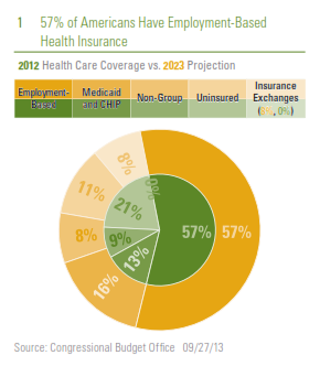
Most, though not all, of the spending patterns discussed below are driven by what type of health insurance, if any, individuals have. Using data compiled by the non-partisan Congressional Budget Office (CBO), which assigns people to their primary source of insurance (many people have multiple sources of insurance, especially those eligible for Medicare who also purchase additional insurance), we find that 156 million people (or 57% of the non-elderly population) have employment-based health insurance. By 2023, the CBO projects that this figure will increase to 162 million but will remain at 57% of the non-elderly population. At 57 million, or 21% of the non-elderly population, the uninsured made up the second-largest portion of the population in 2012. The CBO projects that under current law, the number of uninsured will drop to 31 million or 11% of the non-elderly population by 2023. More people are likely to move onto Medicaid and to the government-run health insurance exchanges as prescribed by the ACA while those purchasing non-group insurance will remain roughly steady at 8% of the non-elderly population. This potential shift in how Americans purchase health insurance has major implications for the overall economy and the outlook for the budget, which we’ll discuss in depth in future editions of the Weekly Economic Commentary.

2013-10-03_Figure_1
How We Spend Our Health Care Dollars

Economy-wide (federal, state, and local governments, corporations, and individuals), Americans spent $2.7 trillion (or roughly 18% of gross domestic product [GDP]) on health care products, services, and investment in 2011, the latest data available.

To put that in perspective, only three countries, China, Japan, and Germany, have economies larger than $2.7 trillion. Ten years ago, the figure was closer to 15% of GDP, and 30 years ago (1982) health care represented less than 10% of GDP. The rise in the percentage of the economy accounted for by health care is because spending on health care has risen much faster than GDP. Over the last 10 years, for example, health care spending has increased at a 5.5% annualized rate while overall GDP has increased at only a 4.0% pace. Although the aging population has played a role in this increase, and will continue to for many decades to come, health care spending per capita has increased 5% per year over the past 10 years to nearly $9,000, suggesting that even without the demographic shift, we are spending more on health care than ever before.

2013-10-03_Figure_2
Of the $2.7 trillion spent economy-wide on health care in 2011, about one-third is on hospital services, another 25% is on professional services (doctors, dentists, clinics), and 15% is on medical products, including pharmaceuticals, medical equipment, and medical supplies. $308 billion is spent by individuals out of pocket on health care, more than is spent by individuals on new passenger cars and light trucks (approximately $240 billion in 2012), furniture and appliances (~$275 billion), or clothing (~$290 billion). Health insurance pays for another $2 trillion in health care expenses. Private insurance covers $900 billion of that $2 trillion, Medicare insurance for the elderly covers $550 billion, and Medicaid insurance for the poor covers $400 billion. The surprise here is that out-of-pocket expenses (~$300 billion) as a percent of total health care expenditures ($2.7 trillion) are just 11%, and have been moving lower for more than five decades.

2013-10-03_Figure_3
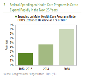
As noted above, we’ll discuss the impact of health care spending on the federal budget in a future edition of the Weekly Economic Commentary, but it’s important to note that the portion of health care spending economywide “sponsored” by governments has risen steadily over the past 25 years and is projected to continue to increase over the next 10 years and beyond, as the population ages and more people move into Medicare.

2013-10-03_Figure_4
Allocation of Health Care Dollars Shifting Toward Government

In 1987, 68% of health care spending was initiated by the private sector (private businesses, households, and health-related philanthropic organizations), with one-third coming from businesses and roughly twothirds from households. Within the private sector, the ratio between businesses (one-third) and household spending (two-thirds) has remained relatively steady over the past 25 years. In 2012, just 55% of health care spending was initiated by the private sector, down from 68% in 1987, while government (federal, state, and local) accounted for 45%, up from 32% in 1987. This trend is expected to rise over the next 10 years.

2013-10-03_Figure_5
Business spending in this context includes:

  • Employer contributions to private health insurance premiums;
  • Employer Medicare Hospital Insurance (HI) payroll taxes;
  • One-half of self-employment contributions to the Medicare HI Trust Fund;
  • Workers’ compensation;
  • Temporary disability insurance; and
  • Worksite health care.

Household spending on health care includes:

  • Out-of-pocket health spending;
  • Employee contributions to employer-sponsored health insurance;
  • Individually purchased health insurance;
  • Employee and self-employment payroll taxes;
  • Premiums paid to the Medicare HI and Supplementary Medical Insurance (SMI) Trust Funds by individuals; and
  • Premiums paid for the Pre-existing Condition Insurance Program (PCIP) beginning in 2010.

2013-10-03_Figure_6
Shifts in the mix of spending by businesses and consumers on various aspects of health care will continue to impact the economy for many years to come, and hopefully inform policy choices about who pays and how much is paid for health care in the coming decades.

2013-10-03_Figure_7
Because the U.S. government is paying an ever-increasing share of health care costs, and more businesses and individuals are paying less out of pocket for health care, the actual cost and quality of health care is not as transparent as it should be. For example, we are likely to know far more about the cost and quality of the house we’re going to buy, the car we’re going to lease, and the vacation we’re going to take than we often do about our health care purchases. The overall cost of health care, combined with the lack of transparency throughout the system, will likely remain ongoing concerns for health care policymakers in the coming years and decades.

_________________________________________________________________________________________________________________________________________________________________________________

IMPORTANT DISCLOSURES

The opinions voiced in this material are for general information only and are not intended to provide specific advice or recommendations for any individual. To determine which investment(s) may be appropriate for you, consult your financial advisor prior to investing. All performance reference is historical and is no guarantee of future results. All indices are unmanaged and cannot be invested into directly.

The economic forecasts set forth in the presentation may not develop as predicted and there can be no guarantee that strategies promoted will be successful.

Stock investing involves risk including loss of principal.

Gross domestic product (GDP) is the monetary value of all the finished goods and services produced within a country’s borders in a specific time period, though GDP is usually calculated on an annual basis. It includes all of private and public consumption, government outlays, investments and exports less imports that occur within a defined territory.

The Congressional Budget Office is a non-partisan arm of Congress, established in 1974, to provide Congress with non-partisan scoring of budget proposals.

This research material has been prepared by LPL Financial.

To the extent you are receiving investment advice from a separately registered independent investment advisor, please note that LPL Financial is not an affiliate of and makes no representation with respect to such entity.

Not FDIC/NCUA Insured | Not Bank/Credit Union Guaranteed | May Lose Value | Not Guaranteed by any Government Agency | Not a Bank/Credit Union Deposit

Member FINRA/SIPC

Communication Breakdown?
September 24, 2013

Communication Breakdown?

In our recent Weekly Economic Commentary: Trust (September 9, 2013), we argued that there was not a clear-cut case for tapering based only on the economic or inflation backdrop. Instead, our view was that concerns expressed by Federal Reserve (Fed) officials over the past six months or so — that additional quantitative easing (QE) could potentially disrupt the smooth functioning of securities markets, cause investors to take on excessive risk and “reach for yield,” and add to financial instability in the global economy — would tip the scales in favor of a taper. Perhaps more important, in our view, were shifting market expectations since Fed Chairman Ben Bernanke’s testimony before the Joint Economic Committee of Congress in May of this year, when he said:

If we see continued improvement, and we have confidence that that is going to be sustained, in the next few meetings we could take a step down in our pace of purchases.

Financial market participants had since come to expect that the Fed would begin to taper this month, absent a major downshift in the economy. Our view was that if the Fed did not follow through on tapering, it risked losing the market’s hard-earned trust, and any trust the markets have in the Fed today will likely come in handy when the Fed has to begin removing stimulus and raising rates in the years ahead.

“The Song Remains the Same”

Ultimately, however, the trust argument did not win the day. The Fed surprised almost everyone last week (September 16 – 20) as the Fed’s policymaking arm, the Federal Open Market Committee (FOMC), voted to maintain its current pace of combined purchases at $85 billion of Treasuries and agency mortgage-backed securities (MBS) as part of its QE program. In making the decision, the FOMC cited tightening financial conditions (likely largely in the form of higher mortgage rates and the flow of credit to small- and medium-sized businesses), the looming fiscal debates, the still-sluggish economy (real gross domestic product [GDP] growth is tracking below 2.0% in the third quarter of 2013), and the sluggish labor market as the reasons for continuing purchases at the same level. In addition to maintaining the current pace of QE, the FOMC strengthened its commitment to keeping its fed funds rate target — currently near zero — at that level until well after it finally winds down its QE program.

2013-09-24_Figure_1

The FOMC’s actions surprised market participants, who expected the FOMC to begin tapering its purchases to around $70 or $75 billion per month, from the current $85 billion per month, and also to confirm that QE would end by mid-2014. Instead, the FOMC backed away from its earlier guidance about ending QE in mid-2014, suggesting a later start date for tapering and a later end date for QE, likely late 2014. In his prepared remarks prior to his post-FOMC meeting press conference on Wednesday, September 18, 2013, and during the Q&A period of the press conference itself, Bernanke worked hard to convince markets that tapering was not tightening, noting:

…even after asset purchases are wound down — which we will do in a manner that is both deliberate and dependent on the incoming economic data — the Federal Reserve’s rate guidance and its ongoing holdings of securities will ensure that monetary policy remains highly accommodative.

“Good Times, Bad Times”

A quick review of the public appearances made by Bernanke and his colleagues on the FOMC since early May 2013, as well as the FOMC statements and minutes from the June and July FOMC meetings, do show that Fed officials essentially repeated that same mantra — predicating a tapering this fall on better data. Markets, especially fixed income and many emerging markets, reacted swiftly to (some of) Bernanke’s words during the spring and summer and drove bond yields sharply higher, largely ignoring the data dependent part of the Fed’s case.
Looking ahead, market participants may need to recalibrate how they listen to the Fed, and the Fed may need to rethink how it communicates with the markets and the public. In an effort to aid the market, and be more transparent, Bernanke laid out the Fed’s action plan for the next several FOMC meetings in several key passages from last week’s post-FOMC press conference [“Ramble On”]. In addition, Bernanke specifically mentioned several metrics the FOMC will be watching in the coming months as it decides whether or not to taper. The indicators he mentioned were:

Inflation

  • The personal consumption deflator excluding food and energy (also known as the core PCE deflator)

The Labor Market

  • Private sector job count
  • Unemployment rate
  • Initial claims for unemployment insurance
  • Aggregate hours worked
  • Consumers’ assessment of whether jobs were easy or hard to get
  • The labor market participation rate
  • The median duration of unemployment
  • Real wages
  • Discouraged workers

Financial Conditions

  • The Federal Reserve Bank of Chicago’s Financial Conditions Index

Fiscal Policy

  • Rasmussen Consumer Sentiment Index, as a proxy for the public’s concern over the looming debates in Congress over the government shutdown(September 30, 2013) and the debt ceiling (mid- to late-October)

2013-09-24_Figure_22013-09-24_Figure_2a

In Figures 1 – 4, we show the recent performance of these important metrics. Inflation remains well below the Fed’s 2% target. Our view is that there are still plenty more factors pushing down on inflation than pushing it up. The next core personal consumption expenditure (PCE) reading (for August 2013) is due out this Friday, September 27, 2013. In Figure 2, we’ve grouped the labor market metrics mentioned by Bernanke into two categories. On the left side of the page are the indicators that Bernanke mentioned as showing some improvement in recent months. The indicators on the right side of the page detail the labor market metrics that have underperformed the Fed’s expectations. While the claims data are released weekly, and the jobs easy-to-get/hard-to-get metric is released along with the consumer confidence data (due out Tuesday, September 24), the market will have to wait until October 4 for the September employment report. With just one more report on the labor market prior to the October 30, 2013 FOMC meeting, it is unlikely that the FOMC would have enough additional evidence that the labor market was improving to take any action on tapering.

Figure 3 does show that financial conditions have tightened since May, and Bernanke’s comments last week suggest that most of this tightening was unwelcome by Fed policymakers. We chose this particular metric (from the Chicago Fed National Financial Conditions Index) to highlight because Bernanke has mentioned it recently, but there are many other measures of financial conditions (St. Louis Fed Financial Stress Index, Senior Loan Officers Survey, and Bloomberg Financial Conditions Index, to name a few) that we and the market will be tracking closely in the weeks ahead. If financial conditions are tighter in late October than they are today, it is unlikely that the Fed would opt to taper at the October 30 FOMC meeting.

2013-09-24_Figure_3

“When the Levee Breaks”

Also arguing against an October taper is the fiscal situation. We chose to use the Rasmussen Consumer Sentiment chart to illustrate consumers’ concerns with the fiscal debate in Congress [Figure 4]. Although this data point is available daily, we chose to present the monthly chart. The chart clearly shows that consumer sentiment has turned lower in recent months, posting back-to-back monthly declines for the first time since mid-2011, the last time the debt ceiling debate dominated the headlines.

2013-09-24_Figue_4

On balance, the FOMC decided at its September 2013 meeting that the weaker-than-expected readings on the economy and inflation, tightening financial conditions (partially as a result of its own communication breakdown with markets since May), and the looming fiscal debate in Congress trumped the trust argument, and chose to maintain the current pace of QE. In our view, Bernanke made a clear case to markets last week that tapering remains data dependent, and he even provided markets with specific metrics the FOMC was watching to gauge progress. One of the key takeaways from last week for markets was Bernanke’s assertion during the Q&A portion of his press conference:

…we can’t let market expectations dictate our policy actions. Our policy actions have to be determined by our best assessment of what’s needed for the economy.

Our view remains that while the Fed may not need the markets’ trust right now, it will down the road as it eventually begins to unwind all the monetary stimulus it has put into the system since 2007.

__________________________________________________________________________________________________________________________________________________________________________________

IMPORTANT DISCLOSURES

The opinions voiced in this material are for general information only and are not intended to provide specific advice or recommendations for any individual. To determine which investment(s) may be appropriate for you, consult your financial advisor prior to investing. All performance reference is historical and is no guarantee of future results. All indices are unmanaged and cannot be invested into directly.

The economic forecasts set forth in the presentation may not develop as predicted and there can be no guarantee that strategies promoted will be successful.

Government bonds and Treasury bills are guaranteed by the U.S. government as to the timely payment of principal and interest and, if held to maturity, offer a fixed rate of return and fixed principal value. However, the value of fund shares is not guaranteed and will fluctuate Mortgage-backed securities are subject to credit, default risk, prepayment risk that acts much like call risk when you get your principal back sooner than the stated maturity, extension risk, the opposite of prepayment risk, and interest rate risk.

Stock investing involves risk including loss of principal.

Quantitative easing (QE) is a government monetary policy occasionally used to increase the money supply by buying government securities or other securities from the market. Quantitative easing increases the money supply by flooding financial institutions with capital in an effort to promote increased lending and liquidity.

The Federal Open Market Committee (FOMC), a committee within the Federal Reserve System, is charged under the United States law with overseeing the nation’s open market operations (i.e., the Fed’s buying and selling of United States Treasure securities).

Gross domestic product (GDP) is the monetary value of all the finished goods and services produced within a country’s borders in a specific time period, though GDP is usually calculated on an annual basis. It includes all of private and public consumption, government outlays, investments and exports less imports that occur within a defined territory.

This research material has been prepared by LPL Financial.

To the extent you are receiving investment advice from a separately registered independent investment advisor, please note that LPL Financial is not an affiliate of and makes no representation with respect to such entity.

Not FDIC/NCUA Insured | Not Bank/Credit Union Guaranteed | May Lose Value | Not Guaranteed by any Government Agency | Not a Bank/Credit Union Deposit

Member FINRA/SIPC

Trading Partners
September 3, 2013

The upward revision to second quarter gross domestic product (GDP) garnered a great deal of market attention last week (August 26 – 30, 2013). The report, released on Thursday, August 29, revealed that second quarter GDP — initially reported in late July 2013 as a 1.7% gain — was revised higher to a 2.5% gain. All of the upward revision to second quarter GDP can be explained by a narrower trade deficit. Initially, the trade deficit in the second quarter was reported as $451 billion, a 0.8% drag on overall GDP growth. Now, the revised data show that the trade gap stood at “only” 422 billion in the second quarter — the same as in the first quarter of 2013 — and as a result, the economic drag from trade for the quarter was eliminated. Looking ahead to the third quarter of 2013 and beyond, market participants and policymakers are asking: Can trade make a significant positive contribution to GDP growth in the quarters ahead, given the outlook for growth in Europe, China, Japan, and emerging markets?

Tracking the Pace of U.S. GDP Growth

While second quarter GDP was revised higher, the first quarter was not subject to revision and remained at 1.1%, leaving GDP growth in the first half of 2013 at a tepid 1.8%. The Federal Reserve (Fed) is still forecasting a 2.45% gain in GDP this year. With 1.8% growth in real GDP in the first half of the year, real GDP would have to grow by more than 3.0% in the third and fourth quarters of 2013 to match the Fed’s consensus forecast for the year. The Fed will release a revised forecast for the economy, labor markets, and inflation for 2013, 2014, and 2015 on September 18, 2013 at the conclusion of the next Federal Open Market Committee (FOMC) meeting. The FOMC is likely to revise downward its 2013 GDP growth forecast. The new forecast, along with the release of the FOMC’s initial public forecast for the economy, inflation, and the labor market in 2016 (also due on September 18), may help to soothe market fears about the pace of tapering and tightening.

Figure_1_-_Blog_-_9-5-2013
The data in hand for the first two months of the third quarter of 2013 suggest that third quarter GDP is tracking to well under 2%, and may be closer to 1%. The data released thus far for the third quarter of 2013 include:

  • Personal consumption expenditures for July;
  • Industrial production for July;
  • Retail sales for July and August;
  • Durable goods shipments and orders for July;
  • Vehicle sales for July;
  • Weekly initial claims for unemployment insurance through the week ending August 24;
  • ISM and regional Federal Reserve Manufacturing Indexes for July and August; and
  • New and existing home sales for July.

Data due out this week (September 2 – 6, 2013) on vehicle sales, the Institute for Supply Management (ISM) Purchasing Managers’ Index (PMI), merchandise trade, construction spending, factory shipments and inventories for July and August 2013, and, of course, the August employment report (due out on Friday, September 6) will help to further clarify the pace of GDP growth in the current quarter, the rest of 2013, and into 2014.

GDP Overseas

Data released over the past several months suggest that the economies in Europe and China have stabilized. Meanwhile, market participants have increased their GDP growth forecasts for Japan over the past nine months, as Japanese policymakers have ramped up monetary and fiscal policy and embarked on a series of structural reforms aimed at jarring Japan’s economy out of a multi-decade slumber. Our view remains that while the economies in China and Europe have stopped getting worse, it may take several more quarters before they can meaningfully re-accelerate. While growth has picked up in Japan — second quarter GDP growth in Japan was 2.6% — it remains disappointing relative to elevated expectations. In addition, many emerging market nations (about 50% of U.S. exports head to emerging markets), including India, Brazil, and Indonesia are now experiencing growth and inflation scares, and some (Brazil and Indonesia) are raising interest rates to head off inflation. Many of the market participants and Fed policymakers who expect U.S. GDP to accelerate in the second half of 2013 and in 2014 are likely counting on accelerating growth in Europe, China, Japan, and emerging markets to drive U.S. exports higher. But is that enough to boost U.S. GDP growth?

As noted in our Weekly Economic Commentary: Exporting Good Old American Know-How, from August 19, 2013, the United States has run a trade deficit (importing more goods and services from other countries than it exports) since the mid-1970s, and our large deficit on the goods side (around $759 billion in 2012) more than offsets the trade surplus we have on the service side of the ledger (around $213 billion in 2012). Combined, our goods and services trade deficit was $547 billion in 2012, slightly smaller than the $569 billion deficit in 2011. As a result of the slight narrowing of the deficit between 2011 and 2012, net exports contributed 0.1% to the 2.8% gain in GDP in 2012.

Net Exports Typically Do Not Boost U.S. GDP Growth

The infographic on page 2, “Profile of U.S. Exports” (Profile) reveals that over the past 40 years — aside from recessions (when imports fall faster than exports, narrowing the trade deficit) — net exports have never added more than 1.0% to overall GDP growth. Thus, even if the economies of Europe, China, Japan, and emerging markets accelerate sharply in the next few quarters, it is unlikely that net exports will provide a large boost to GDP growth this year.

In theory, an unexpected uptick in economic activity among our largest  export destinations should be a plus for our exports to that region, but in practice, the impact to our trade balance and economy may not immediately reflect the better growth prospects overseas. In addition, exchange rate movements also can influence cross-border trade, but movements often work with a long lag. Since many of our exports do not compete on price, the value of the dollar is not always the best way to gauge the relative strength of our exports to many markets. Generally speaking, U.S. exports compete globally on quality, rather than price.

Export Destinations: Economic Prospects in Canada and Mexico

The Profile details the destinations (trading partners) and mix (goods versus services) of our exports. Fourteen percent of our exports (both goods and services) are bound for the Eurozone, while just 6% head to China. Remarkably, only 5% of our exports go to Japan. Combined, our exports to the Eurozone, Japan, and China account for 25% of our total exports. Closer to home, 16% of our exports head north of the border to Canada, and another 11% head south of the border to Mexico. Thus, our exports to our two closest neighbors (27% of all exports) are larger than our exports to the Eurozone, Japan, and China combined (25%). Accordingly, market participants should probably pay more attention to the economic prospects of Canada and Mexico and a bit less to the prospects of China, the Eurozone, and Japan.

Mix of Goods/Services: Goods Are 70% of All Exports

The Profile also details the goods/services mix of our exports. Currently, goods account for around 70% of all exports, but that varies widely by trading partner. The export mix to Canada and Mexico is skewed toward goods rather than services, which is partially explained by auto production, since auto parts factories and final assembly plants account for such a large portion of trade. Our export mix to the Eurozone, China, and Japan is…well… more mixed. Services, at around 40%, account for more of our trade to the Eurozone and Japan than in our overall trade mix. In China, however, an above-average 78% of our exports are goods. All else being equal, an unexpected and permanent shift higher in economic growth for trading partners like China, the Eurozone, and Japan should boost our exports to those nations over time and, in turn, our GDP. But it is important to note that outside of recessions, net exports rarely add more than 0.5% to GDP growth. So while we spend a great deal of time discussing the health of the economy in China, the Eurozone, Japan, and emerging markets, the economic prospects of our nearest neighbors (Canada and Mexico) have a bigger influence on our overall exports.
______________________________________________________________________________________________________________________________________________________________________________

IMPORTANT DISCLOSURES

The opinions voiced in this material are for general information only and are not intended to provide specific advice or recommendations for any individual. To determine which investment(s) may be appropriate for you, consult your financial advisor prior to investing. All performance reference is historical and is no guarantee of future results. All indices are unmanaged and cannot be invested into directly.

Gross domestic product (GDP) is the monetary value of all the finished goods and services produced within a country’s borders in a specific time period, though GDP is usually calculated on an annual basis. It includes all of private and public consumption, government outlays, investments and exports less imports that occur within a defined territory.

The economic forecasts set forth in the presentation may not develop as predicted and there can be no guarantee that strategies promoted will be successful.

International investing involves special risks, such as currency fluctuation and political instability, and may not be suitable for all investors.

Purchasing Managers Index (PMI) is an indicator of the economic health of the manufacturing sector. The PMI index is based on five major indicators: new orders, inventory levels, production, supplier deliveries and the employment environment.

Markit is a leading, global financial information services company that provides independent data, valuations and trade processing across all asset classes in order to enhance transparency, reduce risk and improve operational efficiency. The Markit Purchasing Managers’ Index (PMIT) is a composite index based on five of the individual indexes with the following weights: New Orders – 0.3, Output – 0.25, Employment – 0.2, Suppliers’ Delivery Times – 0.15, Stocks of Items Purchased – 0.1, with the Delivery Times Index inverted so that it moves in a comparable direction.

The Institute for Supply Management (ISM) index is based on surveys of more than 300 manufacturing firms by the Institute of Supply Management. The ISM Manufacturing Index monitors employment, production inventories, new orders, and supplier deliveries. A composite diffusion index is created that monitors conditions in national manufacturing based on the data from these surveys.

Challenger, Gray & Christmas is the oldest executive outplacement firm in the United States. The firm conducts regular surveys and issues reports on the state of the economy, employment, job-seeking, layoffs, and executive compensation.

This research material has been prepared by LPL Financial.

To the extent you are receiving investment advice from a separately registered independent investment advisor, please note that LPL Financial is not an affiliate of and makes no representation with respect to such entity.

Not FDIC/NCUA Insured | Not Bank/Credit Union Guaranteed | May Lose Value | Not Guaranteed by any Government Agency | Not a Bank/Credit Union Deposit

Member FINRA/SIPC