Archive for the ‘GDP – Gross Domestic Product’ Category

Deficit Distraction
August 27, 2013

Deficit Distraction

In the 12 months ending July 2013, the federal government spent $3.4 trillion and took in $2.7 trillion in revenues, making the federal deficit (revenues less spending) about $725 billion, the smallest deficit recorded since late 2008. At just 3.5%, the deficit as a percent of nominal gross domestic product (GDP) over the past 12 months was also the smallest since late 2008, and stands in sharp contrast to the 10% deficit-to-GDP ratio posted in fiscal year (FY) 2009 ending September 2009 [Figure 1].

2013-08-27_Figure1

The story is much the same fiscal year to date in FY 2013, which ends on September 30, 2013. In the first 10 months of FY 2013, the budget deficit was $607 billion, or roughly 3.6% of GDP. Outlays have totaled $2.9 trillion and revenues have totaled $2.3 trillion. The first 10 months of FY 2013 saw the smallest deficit and deficit to GDP of any comparable period back to the first 10 months of FY 2008. An improved economy, a stronger labor market, spending cuts from sequestration, and recent changes to tax rates account for most of the improvement, although a few “one-time items” have also played a role. The non-partisan Congressional Budget Office (CBO), which produces an excellent update on the progress of the federal budget every month called “Monthly Budget Review” (see http://www.cbo.gov), continues to project that the budget deficit in FY 2013 will total $642 billion, or around 4.0% of GDP.

What’s Driving the Improvement in the Deficit?

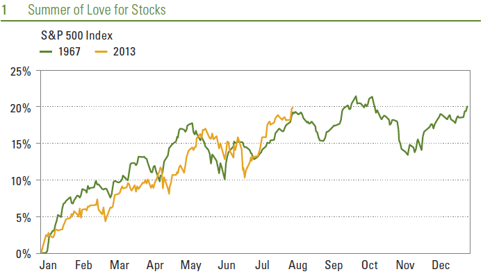
Fiscal year to date in 2013, federal revenues are up 14%, while spending is down nearly 4%. Combined individual income tax receipts — which account for around 85% of federal revenues — are up 15% in the first 10 months of FY 2013 versus the same period in FY 2012. Personal income taxes account for roughly 50% of Federal revenues while taxes withheld for Social Security and Medicare account for 35% of federal revenues. A better labor market (2.3 million net new jobs were created over the past 12 months) and rising wages (wage and salary income, as measured by the monthly report on personal income and spending, is up 4% year over year), account for some of the gain. The fiscal cliff — the expiration of the Social Security payroll tax cut in January 2013 and the increase in tax rates for incomes above certain thresholds — have also boosted revenues. The rising equity market has also accounted for some of the gain in individual tax revenues: equity markets hit new all-time highs in the first half of 2013 and investors may set aside tax payments after exercising stock options or selling stocks. Corporate profits are at record levels, and corporate tax receipts are up 17% in the first 10 months of FY 2013 versus the similar period in FY 2012. Corporate tax receipts account for 10 – 15% of federal tax revenues [Figure 2].

2013-08-27_Figure2

At $2.9 trillion, federal budget outlays in the first 10 months of FY 2013 were $90 billion (or 4%) lower than in the same period in 2012. Not surprisingly, given the solid performance of the labor market noted above, federal spending on unemployment benefits was down a whopping 24% in the first 10 months of FY 2013, while defense spending (impacted in part by the sequester) fell 7%. Federal spending activities outside of defense and entitlement programs like Social Security, Medicare, and Medicaid fell 3% in the first 10 months of FY 2013 versus the first 10 months of FY 2012, but that figure is skewed lower by payments received by the federal government from the Troubled Asset Relief Program (TARP) and big payments from the large, quasi-government mortgage giants Fannie Mae and Freddie Mac that were at the center of the financial crisis. Despite the distortions, the sequester is having a modest impact in controlling non-defense discretionary spending. Interest payments on the public debt totaled $216 billion in the first 10 months of FY 2013, down 2% from the $222 billion in the similar period of FY 2012 [Figure 3].

2013-08-27_Figure3

Warning Signs

Some warning signs exist in the otherwise positive budget picture thus far in FY 2013 however, and if these warning signs continue to be ignored by policymakers, the near-term improvement in the budget picture is not likely to last. FY 2013 to date, federal spending on mandatory programs (payments set by formula written into the law) like Social Security, Medicare, and Medicaid is running above the pace of nominal GDP growth. Federal spending on Social Security benefits is up 5.4%, nearly twice the rate of nominal GDP growth over the past year (2.9%). Similarly, spending on Medicare is up 3.0% in the first 10 months of FY 2013, while Medicaid spending is up 5.7%, also about twice the rate of nominal GDP growth. The non-partisan CBO expects the improvement in the federal budget deficit to continue over the rest of this fiscal year, and for the next several fiscal years as well, through FY 2015. By then, the CBO expects the deficit as a percent of GDP to fall to 2.0%, the smallest since the 1.2% deficitto- GDP-ratio recorded in FY 2007, the last fiscal year prior to the Great Recession. From a 2.0% deficit-to-GDP ratio in FY 2015, the CBO projects that under current law, the deficit will increase to 3.2% in FY 2020 and to 3.5% by FY 2023, the last year the CBO makes a projection.

Most of the deficit deterioration in the latter half of this decade and the first half of the next occurs as a result of deterioration in the structural deficit, i.e., spending on mandatory programs like Social Security, Medicare, and Medicaid far outstripping the pace of GDP growth, mainly due to an aging population. The CBO projects that tax receipts targeted for use by those programs will only grow at the same pace as the overall economy over the next 10 years or so. Thus, the risk is that Congress and the general public will be distracted by the rapidly improving near-term budget outlook, and will not address the longer-term structural budget problem quickly enough to head off a worsening, long-term budget deficit.

____________________________________________________________________________________________________________

IMPORTANT DISCLOSURES

The opinions voiced in this material are for general information only and are not intended to provide specific advice or recommendations for any individual. To determine which investment(s) may be appropriate for you, consult your financial advisor prior to investing. All performance reference is historical and is no guarantee of future results. All indices are unmanaged and cannot be invested into directly.

Gross domestic product (GDP) is the monetary value of all the finished goods and services produced within a country’s borders in a specific time period, though GDP is usually calculated on an annual basis. It includes all of private and public consumption, government outlays, investments and exports less imports that occur within a defined territory.

The economic forecasts set forth in the presentation may not develop as predicted and there can be no guarantee that strategies promoted will be successful.

International investing involves special risks, such as currency fluctuation and political instability, and may not be suitable for all investors.

Purchasing Managers Index (PMI) is an indicator of the economic health of the manufacturing sector. The PMI index is based on five major indicators: new orders, inventory levels, production, supplier deliveries and the employment environment.

Markit is a leading, global financial information services company that provides independent data, valuations and trade processing across all asset classes in order to enhance transparency, reduce risk and improve operational efficiency. The Markit Purchasing Managers’ Index (PMIT) is a composite index based on five of the individual indexes with the following weights: New Orders – 0.3, Output – 0.25, Employment – 0.2, Suppliers’ Delivery Times – 0.15, Stocks of Items Purchased – 0.1, with the Delivery Times Index inverted so that it moves in a comparable direction.

The S&P/Case-Shiller U.S. National Home Price Index measures the change in value of the U.S. residential housing market. The S&P/Chase-Shiller U.S. National Home Price Index tracks the growth in value of real estate by following the purchase price and resale value of homes that have undergone a minimum of two arm’s-length transactions. The index is named for its creators, Karl Chase and Robert Shiller.

_____________________________________________________________________________________________________________________________________________________________________________

This research material has been prepared by LPL Financial.

To the extent you are receiving investment advice from a separately registered independent investment advisor, please note that LPL Financial is not an affiliate of and makes no representation with respect to such entity.

Not FDIC/NCUA Insured | Not Bank/Credit Union Guaranteed | May Lose Value | Not Guaranteed by any Government Agency | Not a Bank/Credit Union Deposit

Member FINRA/SIPC

Exporting Good Old American Know-How
August 20, 2013

The United States has run a trade deficit (importing more goods and services from other countries than it exports) since the mid-1970s. Although the trade deficit narrows during recessions — imports typically fall faster than exports during a recession — the trade gap has increased over time, and currently stands at around 3.5% of gross domestic product (GDP) [Figure 1]. This large and persistent trade deficit acts as a drag on overall GDP growth, since sales of exports are added to GDP, while purchases of imports are subtracted. Along with our massive budget deficit, the trade deficit is one of the major economic challenges facing the United States and has fostered the oft repeated conventional wisdom that “we don’t make anything in this country anymore,” or “everything I buy or own is made in China.” In this week’s Weekly Economic Commentary, we focus on the details of what we import and export and how that impacts the U.S. labor market. Inside Look at U.S. Trade Deficit The trade deficit is computed by adding up the value of all the goods and services made in the United States and shipped to other countries, and subtracting the value of all the goods and services from abroad purchased in the U.S. Our large deficit on the goods side (around $759 billion in 2012*) more than offsets the trade surplus (around $213 billion in 2012) we have on the service side of the ledger. Combined, our goods and services trade deficit was $547 billion in 2012. The composition of the deficit on the goods side (what we import) contributes to the notion that “we don’t make anything in the U.S. anymore,” while the “hidden” surplus on the service side gets little attention.

2013-08-20_Figure1A

Trade Surplus and Where the Jobs Are

Figure 2 helps to illustrate the point that where we have a trade surplus (in the service sector), we create jobs, and relatively high paying jobs. As noted previously, the United States ran a $759 billion trade deficit in the goods sector in 2012. Just 1 million jobs have been added in the goods-producing sector since the trough in the labor market in early 2010. The median hourly wage in the goods-producing sector is $26.05. In contrast, we run a $213 billion trade surplus in the service sector, where 6.4 million jobs have been added since the February 2010 nadir in employment. In addition, in the areas where we have the largest service sector trade advantage (professional and technical services, motion pictures, broadcasting, performing arts and sports, insurance carriers, securities, commodities and investments, data processing and hosting, etc.) the median hourly wage ($32.91) is more than 25% above the median hourly wage in manufacturing, construction, and mining and natural resources ($26.05). In general, the jobs in the export-oriented service sector require more advanced skills, and, in most cases, advanced education and training.

2013-08-20_Figure2B

That is not to say that the goods-manufacturing sector is not creating any new jobs or will not create any in the coming years. Indeed, aided by much cheaper energy inputs, a flexible and well-educated labor force, a high unemployment rate, and higher quality control standards, along with some well-placed “arm twisting” from federal, state, and local governments, a few bright spots have emerged in the manufacturing economy in recent years. The sector has created 530,000 jobs since the trough in employment in early 2010, the best performance over a similar time frame since 1998, and more jobs in this area are likely on the way. The caveat here is that 95% of the manufacturing jobs created since early 2010 have been in durable manufacturing (autos and light trucks, appliances, fabricated metal products, and machinery), all areas that mostly require advanced skills. Just a handful of jobs have been created in the non-durable manufacturing area, where the United States does not have a particular competitive
advantage.

Consumer and Consumer-Related Items Dominate U.S.
Goods Imports

The list of our top 10 imported items is full of consumer and consumer related items like apparel, computers and electronic equipment, transportation equipment, oil and gas, petroleum and coal, and the somewhat deceiving “miscellaneous manufactured goods” category. This category of imported goods — which includes household items like jewelry, sporting goods, toys and games, office supplies, etc. — is found in the grocery stores and big box discount stores we shop in every day. We imported $102 billion of these goods in 2012 and exported just $44 billion. Although this category is not the main driver of our overall trade deficit, it is certainly one of the most visible manifestations of it, and contributes to the overall perception that “we don’t make anything here anymore.” Employment in this area of manufacturing peaked in 1978 at around 7 million workers. Today, only 4.5 million people are employed in the manufacturing of non-durable goods.

U.S. Service Exports Are Growing Rapidly

What is not as visible to most Americans (and to most pundits and media outlets) is that the United States is a net exporter of services, and that our service exports are growing rapidly, as consumers and businesses around the world demand America’s intellectual property and expertise — and culture too. Service exports were at an all-time high in 2012, and have more than doubled in the past 10 years. Eighty percent of U.S. jobs are service related, and although much is made of the maligned “hamburger flipper” service job, many U.S. service-related jobs require advanced degrees and advanced skills, and help to make possible our booming business in service exports.

Good Old American Know-How in Demand

Our top service export, business, professional, and technical services, is a fancy name for good old American know-how. At $153 billion, this would have been our fifth-largest export in 2012. It includes fields ranging from education, oil field services, and entertainment, to advertising, computer and data processing services, and database and other information services, as well as research, development, and testing services.

This category of exports is basically invisible to average Americans unless they (or someone they know) work in these fields. Nearly 19 million Americans (16% of overall employment in the United States) are employed in this category of service exports, and, unlike most other measures of employment, this category has completely recovered from the Great Recession. Of course, not all of those 19 million jobs are tied to exports, but a sizable portion is.

Exporting Hollywood

Another service export category that stands out is royalties, license fees, copyrights, and broadcast rights, with $124 billion of exports in 2012 [Figure 3]. This includes fees earned by U.S. television networks and movie studios selling licenses to foreign media outlets for overseas broadcasts of TV shows like CSI, Family Guy, Jersey Shore, Law and Order, The Big Bang Theory, ICarly and, of course, the Super Bowl, and movies like Iron Man 3, Despicable Me, Monsters University, and Fast and Furious. It also includes U.S. firms like Microsoft, Apple, Oracle, and Cisco licensing their software for use overseas. Similarly, U.S. companies garnered $43 billion in fees in 2012 by selling their patented manufacturing processes to overseas firms. Financial services (investment banking, advisory fees, trading, trust, custody, etc.) provided by Wall Street investment banks and other large commercial banks netted $76 billion in fees in 2012.

2013-08-20_Figure3

Foreigners who visited the United States in 2012 spent a whopping $126 billion on hotels, rental cars, and other goods and services while they were here, far outstripping the $83 billion American travelers spent abroad. Looking at combined goods and services export categories, travel would rank sixth. We also ran a huge trade surplus in education, where foreign students spent $25 billion in 2012 to study in the United States, while U.S. students spend just $6 billion to study at overseas colleges and universities.

With the exception of insurance services and freight and port services, the United States enjoys a trade surplus in every major category of services. Most major service export categories have experienced near 10% growth per year over the past 10 years, driven higher by fast-growing emerging market economies eager to consume good old American know-how, along with American culture (TV, movies, Times Square, Hollywood, and Disney World), and expertise ranging from accounting to software and, of course, our world-renowned colleges and universities. In short, the United States is still one of the world’s largest exporters of goods and services, and our fastest-growing exports (services) aren’t always as visible as some of the items we import and consume every day.

Looking ahead, our competitive advantage in the service sector, including good old American know-how, should help to continue to drive employment higher in this sector, especially in areas that require advanced skills. Our reliance on exports (and employment) in the less volatile service sector, which continue to be in high demand in fast-growing emerging markets worldwide, should help to promote longer U.S. economic expansions and less dependence on the boom-and-bust inventory cycles that accompany more goods-based export-dependent economies around the world. American “know-how” is our most abundant resource and should continue to make the United States an attractive destination for the world’s capital.

____________________________________________________________________________________________________________

IMPORTANT DISCLOSURES

The opinions voiced in this material are for general information only and are not intended to provide specific advice or recommendations for any individual. To determine which investment(s) may be appropriate for you, consult your financial advisor prior to investing.  All performance reference is historical and is no guarantee of future results. All indices are unmanaged and cannot be invested into directly.

The economic forecasts set forth in the presentation may not develop as predicted and there can be no guarantee that strategies promoted will be successful.

Gross domestic product (GDP) is the monetary value of all the finished goods and services produced within a country’s borders in a specific time period, though GDP is usually calculated on an annual basis. It includes all of private and public consumption, government outlays, investments and exports less imports that occur within a defined territory.

Purchasing Managers’ Index (PMI) is an indicator of the economic health of the manufacturing sector. The PMI index is based on five major indicators: new orders, inventory levels, production, supplier deliveries and the employment environment.

Quantitative easing is a government monetary policy occasionally used to increase the money supply by buying government securities or other securities from the market. Quantitative easing increases the money supply by flooding financial institutions with capital in an effort to promote increased lending and liquidity.

Markit is a leading, global financial information services company that provides independent data, valuations and trade processing across all asset classes in order to enhance transparency, reduce risk and improve operational efficiency. The Markit Purchasing Managers’ IndexT (PMIT) is a composite index based on five of the individual indexes with the following weights: New Orders – 0.3, Output – 0.25, Employment – 0.2, Suppliers’ Delivery Times – 0.15, Stocks of Items Purchased – 0.1, with the Delivery Times Index inverted so that it moves in a comparable direction.

This research material has been prepared by LPL Financial.

To the extent you are receiving investment advice from a separately registered independent investment advisor, please note that LPL Financial is not an affiliate of and makes no representation with respect to such entity.

Not FDIC/NCUA Insured | Not Bank/Credit Union Guaranteed | May Lose Value | Not Guaranteed by any Government Agency | Not a Bank/Credit Union Deposit

Member FINRA/SIPC

Measuring Economic Expansion
August 13, 2013

The U.S. economy is now in the fifth year of the 12th economic recovery (or expansion) since the end of World  War II. It is already the sixth-longest expansion and would have to last another year to become the fifth longest, as discussed in last week’s Weekly Economic Commentary: Revisiting the Recovery. This week, we will  compare the performance of gross domestic product (GDP) — the broadest measure of economic activity —  and its components (consumer spending, business capital spending, government spending, etc.) in the current  recovery to previous economic recoveries.

Where We Stand vs. Prior Recoveries

The Great Recession of 2007 – 2009 ended in the second quarter of 2009, and the economy has been growing  for 16 quarters now. Of the other 11 economic expansions since the end of WWII, just five lasted at least four years — the recoveries that began in 1961, 1975, 1982, 1991, and 2001. By the end of their fourth year in the five  expansions that lasted 16 quarters or more (or “comparable recoveries”), real GDP, on average, had  increased by a cumulative 19% from the end of (or trough) the prior recession. In the current expansion, the  economy has grown by just 9% over the last four years (from $14.4 trillion in Q209 to $15.6 trillion in Q213) [Figure 1].

2013-08-14_Figure_1

The Pace of GDP

Consumer spending, which accounts for more than two-thirds of GDP, has matched the performance of overall GDP in this expansion, growing 9% from the trough versus an average 18% gain from the trough in the other five post WWII comparable recoveries. With the exception of exports, all the other major components of GDP — business capital spending, housing, business spending on structures (office parks, malls, factories, etc.),  exports and government spending — have badly underperformed the average post-WWII recovery. Why has  the current recovery been so lackluster even after such a severe recession?

Several factors along with uncertainty over legislative and regulatory policy in Washington have contributed to weak growth, not only in consumption, but in all the sectors of the economy over the past four years. These factors include strained balance sheets, only modest gains in the labor market, banks’ unwillingness to lend after billions of losses in the housing bust, and a weak external environment (recession in Europe, slowdown in China, and emerging markets).

While the current expansion has lagged comparable expansions in almost every category of GDP, it may not be an “apples-to-apples” comparison. As we noted in last week’s Weekly Economic Commentary, the U.S. economy has changed significantly since the end of the inflationary 1970s. The last 30-plus years has seen the  transformation of the U.S. economy from a domestically focused manufacturing economy to a more export- heavy, service-based economy. In general, this economic structure is less prone to inventory swings that drove  the shorter boom-bust cycles of the past, and has led to longer expansions. On average, the last three expansions — the ones that began in 1982, 1991, and 2001 — lasted 95 months, or roughly eight years. Using those three expansions as the standard, at 49 months (16 quarters) the current economic expansion is at its midpoint, but it has been far less robust.

Using just the last three economic expansions for comparison, the pace of GDP growth in the past four years  still lags the average. GDP grew by 16% over the first four years of the last three expansions, and even by that standard the current recovery (9%) is not up to par. Still, in every major category — except exports, where the current recovery matches the prior three — the current expansion falls short, in some cases far short, of the past three recoveries, especially in government spending, housing, and business investment in structures. Taking the Pulse of Government Spending Government spending in all post-WWII expansions has generally not kept pace with overall growth in GDP. Four years into the average post-WWII expansion, government spending (federal, state, and local) has increased, by 10%, about half of the increase in overall GDP (20%) [Figure2]. In the past 30 years, government spending in the first four years of expansion has increased, on average, by just 9%, lagging the overall pace of economic activity but still adding to growth. However, in the current expansion, government spending has decreased by 6%, with state and local government spending taking the biggest hit (down 8% from the second quarter of 2009). At the federal level, overall spending is down 5% from the second quarter of 2009, with an 8% cut to defense spending more than offsetting a 4% increase in non-defense  spending.

Spending at the state and local level is now stabilizing, after more than five years of spending cuts. At the  federal level, the impact of the sequester, the fiscal cliff, and defense cuts were still reverberating through the economy as the second half of 2013 began. On balance, government spending should be less of a drag on growth in the next four years than it was in the first four of the recovery, when government spending added to growth in only three of 16 quarters.

Taking the Pulse of the Housing Market

Although it got a late start, housing — at the epicenter of the Great Recession — has outperformed the overall  economy over the past four years (as it typically does during expansions), but underperformed relative to its performance in past expansions. Housing (as measured by investment in new residential structures) has increased by 30% over the past four years, far above the 9% gain in GDP in that span. But the 30% gain pales in comparison to the 50% average gain in housing in the first four years of all post-WWII recoveries, and also falls  far short of the 51% average gain in housing during the past three expansions (1982, 1991, and 2001). The hangover from the housing bust (large amounts of unsold inventory, difficulty in obtaining financing, poor consumer credit profiles, and a lackluster labor market) helps explain housing’s underwhelming performance in this recovery.

Looking ahead, our view remains that housing is in the early stages of a long recovery, aided by pent-up  demand, near record-low inventories, near record-high housing affordability, a steadily improving labor market, and banks’ increased willingness to lend to borrowers. The recent rise in mortgage rates is a concern, but will likely only slow, not stop, the ongoing recovery in housing, which is being driven, in part, by cash buyers and pent-up demand.

Taking the Pulse of Business Investment in New Structures

On average, business investment in new structures (shopping malls, office buildings and office parks, factories, etc.) over the first four years of all post-WWII expansions rose 6%, lagging the pace of the average recovery in GDP (19%) [Figure 2]. Why does business investment in structures lag overall growth? In part, because these are typically very large projects with long lead times and require outsized commitments of capital, so  businesses want to make sure the expansion is well entrenched before committing resources. As a result, this segment of GDP tends to lag during the early part of expansions and then picks up steam as the expansion matures. We would expect the same pattern to repeat in the current expansion.

2013-08-14_Figure_2

In the three expansions since 1980, business investment on structures actually dropped by 7% over the first 16  quarters of the expansion, lagging the average of all post-WWII expansions (a 6% gain over four years). But the current expansion has seen business investment in structures fall by 9% over the past four years, an even worse performance than in the past three expansions (a 7% decrease). Business uncertainty around the health and longevity of the expansion, the turmoil in Europe and slowdown in China, as well as the legislative and regulatory backdrop, overwhelmed the positive impact of lower financing rates and years of pent-up demand. We expect business investment in structures to pick up steam and become a bigger contributor to growth in  the second half of the expansion, aided by somewhat less legislative and regulatory concern and more confidence in the economy.

Taking the Pulse of Business Investment in New Structures

On average, business investment in new structures (shopping malls, office buildings and office parks, factories, etc.) over the first four years of all post-WWII expansions rose 6%, lagging the pace of the average recovery in GDP (19%) [Figure 2]. Why does business investment in structures lag overall growth? In part, because these  are typically very large projects with long lead times and require outsized commitments of capital, so businesses want to make sure the expansion is well entrenched before committing resources. As a result, this segment of GDP tends to lag during the early part of expansions and then picks up steam as the expansion matures. We would expect the same pattern to repeat in the current expansion.

In the three expansions since 1980, business investment on structures actually dropped by 7% over the first 16 quarters of the expansion, lagging the average of all post-WWII expansions (a 6% gain over four years). But the current expansion has seen business investment in structures fall by 9% over the past four years, an even worse performance than in  the past three expansions (a 7% decrease). Business uncertainty around the health and longevity of the expansion, the turmoil in Europe and slowdown in China, as well as the legislative and regulatory backdrop,  overwhelmed the positive impact of lower financing rates and years of pent-up demand. We expect business  investment in structures to pick up steam and become a bigger contributor to growth in the second half of the  expansion, aided by somewhat less legislative and regulatory concern and more confidence in the economy.

Expansion Lagging Average Post-WWII Recovery

Although it is four years old, the current economic expansion has not felt like a real expansion to many consumers and businesses. Indeed, the data suggest that in virtually every segment of the economy, the current expansion has lagged the average post-WWII expansion and the three expansions since 1980, which are more comparable. While some of the factors that have weighed on the expansion are lifting, others, notably rising interest rates, are poised to take their place and we continue to expect modest (near 2.0%) growth in 2013.

______________________________________________________________________________________________________________

IMPORTANT DISCLOSURES

The opinions voiced in this material are for general information only and are not intended to provide specific advice or recommendations for any individual. To determine which investment(s) may be appropriate for you, consult your financial advisor prior to investing. All performance reference is historical and is no guarantee of future results. All indices are unmanaged and cannot be invested into directly.

The economic forecasts set forth in the presentation may not develop as predicted and there can be no guarantee that strategies promoted will be successful.

Gross domestic product (GDP) is the monetary value of all the finished goods and services produced within a country’s borders in a specific time period, though GDP is usually  calculated on an annual basis. It includes all of private and public consumption, government outlays, investments and exports less imports that occur within a defined territory.

The Federal Open Market Committee (FOMC), a committee within the Federal Reserve System, is charged under the United States law with overseeing the nation’s open market operations (i.e., the Fed’s buying and selling of United States Treasure securities).

Quantitative easing is a government monetary policy occasionally used to increase the money supply by buying government securities or other securities from the market.  Quantitative easing increases the money supply by flooding financial institutions with capital in an effort to promote increased lending and liquidity.

This research material has been prepared by LPL Financial.

To the extent you are receiving investment advice from a separately registered independent investment advisor, please note that LPL Financial is not an affiliate of and makes no representation with respect to such entity

Not FDIC/NCUA Insured | Not Bank/Credit Union Guaranteed | May Lose Value | Not Guaranteed by any Government Agency | Not a Bank/Credit Union Deposit

Member FINRA/SIPC

Summer of Love
August 6, 2013

Summer of Love

It has been a summer of love for the stock market. As the temperatures heated up, so did the stock market. From June 24 to August 2, 2013, the S&P 500 Index rose 9%, pushing stocks up about 20% for the year. The last time we saw stocks perform the way they have this year in both pattern  and magnitude was 1967 [Figure 1]

2013-08-07_figure_1

During 1967’s Summer of Love, the Haight-Ashbury neighborhood of San Francisco became the center of a cultural movement known as the Hippie Revolution, but there was a lot more going on economically and socially that offer parallels to today that could explain the stock market similarity:

  • Bond yields rose over the course of 1967, but most notably from April to August when the 10-year Treasury note rose about one percentage point — similar to this year’s move over the same time period.
  • Gross domestic project (GDP) averaged a lackluster 2% in the first half of 1967, not too far from the 1.4% growth seen in 2013’s first half.
  • Earnings per share growth for S&P 500 companies was pretty flat on a year-over-year basis then and now.
  • Protest politics took place around the world in 1967; this year, Egypt and Brazil are two of the hot spots for protest-driven societal change.
  • Recent events still bring forth faint echoes of the race and gender equality struggles of 1967.
  • Detroit’s bankruptcy was almost 46 years to the day that the Detroit riots of 1967 broke out and are considered to be the seminal event that started the erosion of the tax base that left the city to declare bankruptcy in 2013.
  • President Obama’s Affordable Care Act and other programs have drawn comparisons to President Johnson’s Great Society programs passed in the mid-1960s, which included Medicare, the extension of welfare, and environmental activism, and were seen as part of a host of large government spending programs that would speed economic growth as they came into effect in 1967 and beyond.
  • The National Security Agency’s (NSA) Project MINARET began in 1967, intercepting electronic communications of U.S. citizens without warrants or judicial oversight. This controversial program can be compared with the revelations in 2013 regarding NSA spying on U.S. citizens.

It can be dangerous to look back selectively. Of course, there are lots of differences between now and 46 years ago, and there is no assurance that stocks will continue to follow the 1967 pattern. Nevertheless, if the pattern in the stock market mirroring 1967 that has unfolded so far this year holds in the second half, we may see a volatile market with a slower pace of gains — but more record highs ahead. That historical flashback happens to be consistent with our market forecast for the second half of the year.

________________________________________________________________________________________________________________________________________________________________________________
IMPORTANT DISCLOSURES

The opinions voiced in this material are for general information only and are not intended to provide specific advice or recommendations for any individual. To determine which investment(s) may be appropriate for you, consult your financial advisor prior to investing. All performance reference is historical and is no guarantee of future results. All indices are unmanaged and cannot be invested into directly.

The economic forecasts set forth in the presentation may not develop as predicted and there can be no guarantee that strategies promoted will be successful.

Stock investing involves risk including loss of principal.

Earnings per share (EPS) is the portion of a company’s profit allocated to each outstanding share of common stock. EPS serves as an indicator of a company’s profitability. Earnings per share is generally considered to be the single most important variable in determining a share’s price. It is also a major component used to calculate the price-to-earnings valuation ratio.

Gross domestic product (GDP) is the monetary value of all the finished goods and services produced within a country’s borders in a specific time period, though GDP is usually calculated on an annual basis. It includes all of private and public consumption, government outlays, investments and exports less imports that occur within a defined territory.
______________________________________________________________________________________________________________________________________________________________________________
INDEX DESCRIPTIONS

The Standard & Poor’s 500 Index is a capitalization-weighted index of 500 stocks designed to measure performance of the broad domestic economy through changes in the aggregate market value of 500 stocks representing all major industries.

S&P 500 Indices are unmanaged and cannot be invested into directly. Unmanaged index returns do not reflect fees, expenses, or sales charges. Index performance is not indicative of the performance of any investment. Past performance is no guarantee of future results.

This research material has been prepared by LPL Financial.

To the extent you are receiving investment advice from a separately registered independent investment advisor, please note that LPL Financial is not an affiliate of and makes no representation with respect to such entity.

Not FDIC or NCUA/NCUSIF Insured | No Bank or Credit Union Guarantee | May Lose Value | Not Guaranteed by any Government Agency | Not a Bank/Credit Union Deposit

Member FINRA/SIPC

Midsummer Madness
July 30, 2013

Eight times a year, the outcome of the Federal Reserve’s (Fed’s) Federal Open Market Committee (FOMC) meeting becomes the focal point for market participants. Four times each year, the first look at the health of the economy in the prior quarter (via the Bureau of Economic Analysis’s (BEA) report on gross domestic product [GDP]), dominates the headlines. Similarly, at the start of each month, the Report on Business from the Institute for Supply Management (ISM) and the monthly labor market report from the U.S. Department of Labor are the centerpieces of any trading week. This week (July 29 – August 2, 2013), all four of these key events are on the docket. How rare is this? In the 708 weeks between January 1, 2000 and today (13 years and seven months), all four of these often market-moving events have all occurred in the same week just seven times, most recently in the last week of January of this year. Historically, these weeks have exhibited 20% more volatility than an average week over this time span.* Add in the 135 S&P 500 companies expected to report their earnings results for the second quarter of 2013 this week, and this week is unlikely to be just another boring mid-summer week for financial market participants.

In addition to those four key events, markets will digest vehicle sales for July, pending home sales for June, home prices for May, as well as key data in China (Purchasing Managers’ Index [PMI] for July) and Japan (industrial production and vehicle sales for June 2013) along with the Bank of England (BOE) and the European Central Bank’s (ECB) monthly policy meetings.

2013-08-01_figure1

FOMC in Focus:
Tuesday, July 30 & Wednesday July 31, 2013

  • This is the fifth of eight FOMC meetings this year.
  • ƒƒThis meeting will not include a press conference from Fed Chairman Ben Bernanke, and the FOMC will not be releasing a new economic forecast at the conclusion of this meeting. In recent years, markets have been conditioned not to expect many changes to Fed policy at FOMC meetings that do not include press conferences and new forecasts from the FOMC.
  • ƒƒThe GDP report for the second quarter of 2013 will be released at the start of the second day of the two-day meeting, and the report will likely show that the economy barely expanded in the quarter. The FOMC will likely acknowledge this in the statement.
  • A lack of communication between the Fed and the markets — especially the bond market — in May and June 2013 led to an uptick in market volatility. The FOMC will likely want to use the statement that follows this week’s meeting to further clarify its position on tapering quantitative easing (QE), but at the same time strengthen its commitment to keep the fed funds rate near zero, even as it is winding down its QE program.
  • As noted in our Mid-Year Outlook 2013, we expect that the Fed will begin to slow its QE program this fall, dependent on the economy meeting the Fed’s above-consensus forecasts. We expect that the Fed will maintain the fed funds rate near zero the rest of this year and all of next year.

Q2 GDP in Focus:
Wednesday, July 31

  • The consensus of economists (as measured by Bloomberg News) is looking for a very modest 1.0% annualized increase in real GDP for the second quarter of 2013. Estimates have moved sharply lower over the past four weeks, as several of the high-profile reports on the economy for May and June that feed into GDP (inventories, exports and imports, retail sales, durable goods shipments) fell short of expectations.
  • The impact of higher taxes, the sequester, cooler-than-usual weather in most of the nation for most of the spring, as well as weak economies in Europe and China all acted as impediments to growth in the second quarter.
  • ƒThe second quarter GDP report may be more difficult than usual for markets to interpret. Every July, the government agency (BEA) that compiles the GDP data releases revised data on GDP and its components going back three years. The revised data are based on new information from individuals, corporations, and businesses across the economy that was not available to the BEA initially.
  • ƒThis year, the GDP accounts are undergoing what the BEA calls a “comprehensive revision.” Every five years or so, the BEA incorporates both new data and new methodology into its revisions of GDP. Overall GDP and its components are subject to revision all the way back to 1929!
  • This year, the most significant changes to the way the BEA calculates GDP come from the treatment of intellectual property (IP). Currently, items like corporate spending on research and development (R&D) or television and film rights are not counted as final GDP. The comprehensive revision will count IP as final GDP, and that will provide a one-time boost to the level of GDP. The market — and the Fed — are well aware of these changes, and although the financial media will likely make a big deal of these changes, the market is not likely to react much.
  • Overall, while the quarter-to-quarter wiggles of GDP growth may change — and perhaps show a deeper Great Recession and a slightly stronger recovery — the pattern of GDP is likely to stay the same.
  • As noted, in our Mid-Year Outlook 2013, we expect that the U.S. economy will continue to grow at about 2% in 2013, supported by housing, as well as consumer and business spending, offsetting the drag from government spending.

July ISM in Focus:
Thursday, August 1, 2013

  • ƒƒThe consensus of economists (as measured by Bloomberg News) is looking for a 52.0 reading on the ISM for July, after the 50.9 reading in June.
  • A reading above 50 on the ISM indicates that the manufacturing sector is expanding.
  • A reading below 50 on the ISM indicates that the manufacturing sector is contracting, and an ISM reading at 42 indicates that the overall economy is in recession.
  • The ISM has been in a narrow range between 49 and 54 for the past 12 months.
  • The Markit PMI — released several weeks ahead of the ISM report — has been gaining acceptance among market participants as a good proxy for the ISM report, and may, over time, diminish the importance to the markets of the ISM report. The Markit PMI reading for July 2013 was strong. At 53.2, it was above consensus expectations of 52.6 and also above the June 2013 reading of 51.9.
  • Over the second half of 2013, we continue to expect the manufacturing sector is likely to be boosted by “onshoring” of jobs, relatively cheap and plentiful supplies of energy, and decent pace of capital spending.  Weakness in Europe and China and a stronger dollar continue to be drags on the manufacturing sector.

July Employment Report in Focus:
Friday, August 2

  • The consensus of economists (as measured by Bloomberg News) is that that the economy created a net new 185,000 jobs in July 2013. The economy has created around 200,000 jobs per month over the past three, six, and 12 months. This figure is derived from a survey of business establishments.
  • The consensus is looking for the unemployment rate (measured from a survey of households) to tick down to 7.5% in July from 7.6% in June. Generally speaking, the economy needs to create around 150,000 jobs per month to keep the unemployment rate steady.
  • The shift in weather from a cool, damp June to a more normal July should lead to a rebound in weather-sensitive areas of employment like leisure and hospitality, food services and recreation.
  • Teachers and other education workers employed by state and local governments are always a wild card this time of year, as most local governments end their fiscal years on June 30. State and local governments have shed teaching jobs in each of the past three months (April, May, and June), and a bounce back could occur in July.
  • Our view is that the health of the labor market as measured by the monthly job count (around 200,000 per month) has met the Fed’s expectations of a “real and sustainable” improvement in the labor market. But other measures of the health of the labor market — hiring rates, the quit rate, and the unemployment rate — still show that the labor market is not yet back to normal See the Weekly Economic Commentary: Real and Sustainable: Revisited from July 8, 2013 for more details.

____________________________________________________________________________________________________________

IMPORTANT DISCLOSURES

The opinions voiced in this material are for general information only and are not intended to provide specific advice or recommendations for any individual. To determine which investment(s) may be appropriate for you, consult your financial advisor prior to investing. All performance reference is historical and is no guarantee of future results. All indices are unmanaged and cannot be invested into directly.

The economic forecasts set forth in the presentation may not develop as predicted and there can be no guarantee that strategies promoted will be successful.

* Between January 2000 and December 2012, the median percent difference between the high price and low price of the week for the S&P 500 was 2.9%. In the weeks where there were all four of these events in the same week, the median percentage difference between the high price and low price of the week for the S&P 500 was 3.5%.

Gross domestic product (GDP) is the monetary value of all the finished goods and services produced within a country’s borders in a specific time period, though GDP is usually calculated on an annual basis. It includes all of private and public consumption, government outlays, investments and exports less imports that occur within a defined territory.

The Federal Open Market Committee (FOMC), a committee within the Federal Reserve System, is charged under the United States law with overseeing the nation’s open market operations (i.e., the Fed’s buying and selling of United States Treasure securities).

Quantitative easing is a government monetary policy occasionally used to increase the money supply by buying government securities or other securities from the market. Quantitative easing increases the money supply by flooding financial institutions with capital in an effort to promote increased lending and liquidity.

Purchasing Managers’ Index (PMI) is an indicator of the economic health of the manufacturing sector. The PMI index is based on five major indicators: new orders, inventory levels, production, supplier deliveries and the employment environment.

The S&P/Case-Shiller U.S. National Home Price Index measures the change in value of the U.S. residential housing market. The S&P/Chase-Shiller U.S. National Home Price Index tracks the growth in value of real estate by following the purchase price and resale value of homes that have undergone a minimum of two arm’s-length transactions. The index is named for its creators, Karl Chase and Robert Shiller.

The Institute for Supply Management (ISM) index is based on surveys of more than 300 manufacturing firms by the Institute of Supply Management. The ISM Manufacturing Index monitors employment, production inventories, new orders, and supplier deliveries. A composite diffusion index is created that monitors conditions in national manufacturing based on the data from these surveys.

Markit is a leading, global financial information services company that provides independent data, valuations and trade processing across all asset classes in order to enhance transparency, reduce risk and improve operational efficiency. The Markit Purchasing Managers’ IndexT (PMIT) is a composite index based on five of the individual indexes with the following weights: New Orders – 0.3, Output – 0.25, Employment – 0.2, Suppliers’ Delivery Times – 0.15, Stocks of Items Purchased – 0.1, with the Delivery Times Index inverted so that it moves in a comparable direction.

This research material has been prepared by LPL Financial.

To the extent you are receiving investment advice from a separately registered independent investment advisor, please note that LPL Financial is not an affiliate of and makes no representation with respect to such entity.

Not FDIC/NCUA Insured | Not Bank/Credit Union Guaranteed | May Lose Value | Not Guaranteed by any Government Agency | Not a Bank/Credit Union Deposit

Member FINRA/SIPC

Crash Course on Student Loans
July 16, 2013

Hysterical Headlines

In recent months, student loans have been all over the news. Some recent headlines include:

“Student loan crisis”

“Student loan rates to double”

“Student loan delinquency skyrocketing”

“Are student loans becoming a macroeconomic issue?”

“Lighting the student loan dynamite”

“Yes, there is a student loan bubble”

“College debt bubble mimics housing bubble”

These headlines, and similar ones, can be found by just typing “student loans” into an internet search engine, or by simply picking up your local newspaper. As with any headlines, there is some truth to this very serious issue, but as always, the devil is in the detail, and the student loan situation is no different. Yes, student loan debt outstanding (nearly $1 trillion) is soaring, student loan rates did double (from 3.4% to 6.8%) on July 1, 2013, thanks to inaction from Congress, and student loan debt is larger than auto financing debt ($800 billion), credit card debt ($660 billion), and home equity debt ($550 billion). In addition, delinquency rates for student loan debt (11%) are nearly double the rate for all consumer credit (6%), and nearly $22 billion in student loan debt is “seriously delinquent” (more than 90 days).

However, 85% of student loan debt is guaranteed by the federal government, likely limiting the impact of rising student loan defaults and delinquencies on private credit markets. Congress agreed last week (July 8 – 12, 2013) to tie student loan rates to the yield on 10-year Treasury notes, which, if adopted into law, would push rates back under 4.0% (from 6.8%) for most student loans. Although $1 trillion of student loan debt is a huge number in absolute terms, it pales in comparison to overall (private and public) U.S. debt outstanding ($55 trillion), the mortgage market ($13 trillion), the Treasury market ($12 trillion) and the corporate bond market ($9 trillion). As the economy and especially the labor market continue to improve, the overall delinquency rate on all consumer debt has moved lower from 9% in 2010 to 6% in early 2013. Student loan delinquency rates followed the same pattern in 2010 (around 9%) and 2011 (under 8.5%) before surging to nearly 12%in 2012. They ticked down a bit in the first quarter of 2013.

Know Your Source

One of the main culprits in the hyperbole surrounding the student loan market is that there is not one universally accepted data source on student loans. For example, if you want to know about the state of the U.S. labor market, the universally accepted data source is the Bureau of Labor Statistics of the U.S. Department of Labor. Similarly, if you want information on gross domestic product (GDP), the Bureau of Economic Analysis of the Department of Commerce is the place to go. On the other hand, there are numerous sources, both public and private sector (and often confusing and conflicting), for student loan data, including, but not limited to:

The Federal Reserve Board of Governors

The Federal Reserve Bank of New York

The College Board

The Congressional Budget Office

Sallie Mae

The Consumer Financial Protection Bureau

The U.S. Department of Education

The Institute for Higher Education Policy

Moody’s

Fitch

Although there are a wide variety of sources for the data, the basic message from all of them is pretty clear. On the surface, the student loan issue is daunting:

Student loans outstanding are closing in on $1 trillion, and they have increased by more than 10% per year on average since 2006.

At 11.2%, the delinquency rates on student loans are rising, and rising rapidly.

The rates on government-backed student loans, while not likely to double, are likely headed higher, making it more difficult for borrowers to repay, and to qualify for other forms of consumer debt (auto and credit card) and for mortgages. This may crimp consumer spending and overall economic growth.

But in our view, the outlook for the student loan issue on the financial system and economy is much more balanced than the rash of recent headlines suggests. An improving economy and labor market—especially for those with a college degree where the unemployment rate is 3.9%, well below the overall unemployment rate of 7.6%—is likely to head off the worst-case scenario of widespread defaults on student loans in the coming years. The risk, however, is that the economy does not improve quickly enough before the onset of the next recession to avert a larger crisis in the next decade or so.

2013-07-16_Student_Loan

_________________________________________________________________________________

IMPORTANT DISCLOSURES

The opinions voiced in this material are for general information only and are not intended to provide specific advice or recommendations for any individual. To determine which investment(s) may be appropriate for you, consult your financial advisor prior to investing. All performance reference is historical and is no guarantee of future results. All indices are unmanaged and cannot be invested into directly.

The economic forecasts set forth in the presentation may not develop as predicted and there can be no guarantee that strategies promoted will be successful.

Gross domestic product (GDP) is the monetary value of all the finished goods and services produced within a country’s borders in a specific time period, though GDP is usually calculated on an annual basis. It includes all of private and public consumption, government outlays, investments and exports less imports that occur within a defined territory.

This research material has been prepared by LPL Financial.

To the extent you are receiving investment advice from a separately registered independent investment advisor, please note that LPL Financial is not an affiliate of and makes no representation with respect to such entity.

Not FDIC/NCUA Insured | Not Bank/Credit Union Guaranteed | May Lose Value | Not Guaranteed by any Government Agency | Not a Bank/Credit Union Deposit

Member FINRA/SIPC

Real and Sustainable: An Update
July 10, 2013

Real and Sustainable: An Update

Just prior to the release of the May 2013 employment, report, we wrote in our June 3, 2013, Weekly Economic Commentary: Real and Sustainable, that in the coming months:

“Federal Reserve (Fed) policymakers must decide if the recent pace of job creation-on average, the economy added 175,000 per month over the past year-and/or the drop in the unemployment rate (from 10.0% at the peak in 2010 and from 8.2% in May 2012) was ‘real and sustainable’ to warrant a tapering of QE.”

“Real and sustainable” was also a phrase used by Fed Chairman Ben Bernanke at his now (in)famous testimony before the Joint Economic Committee (JEC) of Congress on May 22, 2013. Answering a question about when the Fed would begin unwinding QE, Bernanke said:

“As the economic outlook and particularly the outlook for the labor market improves in a real and sustainable way, the committee will gradually reduce the flow of purchases.”

Bernanke used similar words answering questions at the press conference following the June 18 – 19 Federal Open Market Committee (FOMC) meeting.

Now, with both the May and June 2013 jobs reports, as well as the June FOMC Meeting and Fed Chairman Bernanke’s press conference in the rearview mirror, financial markets have largely embraced the notion that the Fed will begin tapering QE sometime this fall. Payroll employment in the private sector in both May and June 2013 exceeded expectations, and the job gains reported for April 2013 and May 2013 were revised markedly higher with the release of the June 2013 data. As a result, the private sector economy has added about 200,000 net new jobs per month over the past three, six, and 12 months [Figure 1]. It is pretty clear that the market, especially the bond market, thinks that adding 200,000 jobs per month is “real and sustainable.”

2013-07-10_Fig_1

Of course, Fed policymakers are not only looking at the number of private sector jobs being created each month. In early March 2013, FOMC Vice Chair Janet Yellen — who is a leading candidate to replace Bernanke as Fed Chairman in 2014 — said that she was looking at a number of indicators on the labor market and economy. These included:

  • The unemployment rate;
  • Payroll employment;
  • The hiring rate;
  • Layoffs/discharges as a share of total job separations;
  • ƒƒ The “quit” rate as a share of total job separations; and
  • Spending and growth in the economy.

Tracking the Labor Market: Not Quite There Yet

Figures 2 – 5 show the labor market indicators mentioned by Bernanke last week and Yellen in early March 2013. A quick review of the figures suggests that while job growth has been “real and sustainable,” several of the other key measures the Fed is monitoring are not yet sending the same signal. Yellen and Bernanke — two of the three FOMC members of the “center of gravity” at the Fed — are probably not yet ready to begin scaling back QE.

2013-07-10_Fig_2

  • While down from the peaks seen during the Great Recession of 2008 – 2009, the unemployment rate, at 7.6% in June 2013, remains well above the 6.5% threshold for raising rates, and also well above the 5.50 – 5.75% rate the FOMC forecasts as the new “normal” unemployment rate. In his prepared comments to the press just prior to his FOMC press conference on June 19, 2013, Bernanke said that QE would likely end in mid-2014, when the unemployment rate hits 7.0%.
  • The economy is now consistently creating 200,000 jobs per month, and has been over the past 12 months.

2013-07-10_Fig_3

  • At 3.6% in April 2013, the latest data available, the hiring rate — the level of new hiring as a percent of total employment measured from the Job Openings and Labor Turnover Survey (JOLTS) data remains depressed, and well below the 4.5 – 5.0% hire rate seen prior to the onset of the Great Recession in 2007. In her March 4, 2013 speech, Yellen noted, “the hiring rate remains depressed. Therefore, going forward, I would look for an increase in the rate of hiring.” The May JOLTS report is due out this Tuesday, July 9, 2013.
  • In that same speech, Yellen noted “layoffs and discharges as a share of total employment have already returned to their pre-recession level”. Indeed, Figure 4 shows that the discharge rate, at 1.2% in April 2013, is very close to an all-time low. A good proxy for this metric is the weekly readings on initial claims for unemployment insurance and the monthly Challenger layoff data, both of which continue to show that companies are reluctant to shed more workers at this point in the business cycle.

2013-07-10_Fig_4

2013-07-10_Fig_5

  • The quit rate measures the percentage of people who leave their jobs voluntarily, presumably because they are confident enough in their own skills — or in the health of the economy — to find another job. In the three months ending in April 2013 (the latest data available), 53% of the people who were separated from their jobs (laid off, fired, retired, or left voluntarily) were job quitters. This reading was just below the 54% readings in February and March 2013, which were the highest readings on this metric since mid- 2008. Even at 54%, this metric remains well below its pre-Great Recession norm of 56 – 60%. Commenting on this metric in her March 4, 2013 speech,  Yellen noted “a pickup in the quit rate, which also remains at a low level, would signal that workers perceive that their chances to be rehired are good — in other words, that labor demand has strengthened.”

2013-07-10_Fig_6

  • The final metrics mentioned by Yellen — consumer spending and overall economic growth — both remain well below average, and indeed still point to an economy that is still running at around two-thirds speed.

GDP and Jobs: Why the Disconnect?

Since the end of the 1981-82 recession, the economy has seen four periods when it has consistently created 200,000 or more private sector jobs per month:

  • Mid-1980s
  • Late 1980s
  • ƒƒ Mid-1990s through the end of the decade
  • ƒƒ Early 2006

On average, when the economy has consistently produced 200,000 jobs over a 12-month period, economic growth — as measured by growth in real gross domestic product (GDP) — has averaged between 4.5% and 5.0%. Today, the economy is struggling to grow at 2.0%, and our forecast is that growth is likely to be near 2.0% over the rest of 2013. What has caused the disconnect between job and GDP growth, and does better job growth mean better economic growth in the period ahead?

In general, the economy leads job growth, not the other way around. The timing of the economic recoveries and labor market recoveries over the past 20 years is helpful in illustrating this point. Coming out of the 2007 – 2009 Great Recession, the economy bottomed out in June 2009, while the labor market did not begin creating jobs regularly until spring 2010. The same pattern played out coming out of the mild recession in 2001. The recession ended in November 2001, but the economy did not begin to consistently create jobs until the summer of 2003. The 1990 – 91 recession ended in March 1991. The private sector economy did not begin creating jobs regularly until a year later, in the spring of 1992.

The recent disconnect between private sector job growth and the performance of the economy can be partially traced to several factors. First, the severity and composition of the Great Recession was unique in its scope, and recent financial-led recessions in other countries suggest that economies recover more slowly from recessions caused by severe financial crisis. Restrictive fiscal policy at both the federal and state and local levels is also a culprit of the disconnect between 200,000 per month job growth and an economy growing at only around 2.0%. In the first half of 2013, the economic drag from fiscal policy (less spending and higher taxes) likely shaved around 2.0% from GDP. In addition, the recession in Europe and the sharp slowdown in emerging markets have sharply curtailed our export growth, which in turn, puts downward pressure on GDP growth.

The bottom line is that job creation tends to lag the overall economy, and that the recent job gains likely do not portend stronger economic growth in the coming months. Any uptick in economic growth over the next few quarters would likely be the result of an easing of fiscal pressures or improvement in the economies in Europe and emerging market countries.

2013-07-10_Fig_7

Closer Look: Labor Market Surveys

  • A survey of 60,000 households nationwide — an incredibly large sample size for a national survey — generates the data set used to calculate the unemployment rate, the size of the labor force, part-time and full-time employment, the reasons for and duration of unemployment, employment status by age, educational attainment, and race. The “household survey” has been conducted essentially same way since 1940, and although it has been “modified” over the years, the basic framework of the data set has stayed the same. The last major modification to the data set (and to how the data is collected) came in 1994. To put a sample size of 60,000 households into perspective, nationwide polling firms typically poll around 1,000 people for their opinion on presidential races.
  • ƒƒThe headline unemployment rate (7.6% in June 2013) is calculated by dividing the number of unemployed (11.8 million in June 2013) by the number of people in the labor force (155.8 million). The civilian population over the age of 16 stood at 245.5 million in June 2013. A person is identified as being part of the labor force if they are over 16, have a job (employed), or do not have a job (unemployed) but are actively looking for work. A person is not in the labor force if they are neither employed nor unemployed. This category includes retired persons, students, those taking care of children or other family members, and others who are neither working nor seeking work.
  • ƒƒ In June 2013, the labor force was 155.8 million, which consists of 144 million  employed people and 11.8 million unemployed people. Another 89.7 million people over the age of 16 were classified as not in the labor force. The 155.8 million people in the labor force plus the 89.7 million people not in the labor force is equal to the civilian population over 16, 245.5 million.
  • The payroll job count data is culled from a survey of 440,000 business establishments across the country. The sample includes about 141,000 businesses and government agencies, which cover approximately 486,000 individual worksites drawn from a sampling frame of Unemployment Insurance (UI) tax accounts covering roughly 9 million establishments. The sample includes approximately one-third of all nonfarm payroll employees. From these data, a large number of employment, hours, and earnings series in considerable industry and geographic detail are prepared and published each month.

___________________________________________________________________________________

IMPORTANT DISCLOSURES
The opinions voiced in this material are for general information only and are not intended to provide specific advice or recommendations for any individual. To determine which investment(s) may be appropriate for you, consult your financial advisor prior to investing. All performance reference is historical and is no guarantee of future results. All indices are unmanaged and cannot be invested into directly.

Gross domestic product (GDP) is the monetary value of all the finished goods and services produced within a country’s borders in a specific time period, though GDP is usually calculated on an annual basis. It includes all of private and public consumption, government outlays, investments and exports less imports that occur within a defined territory.

The economic forecasts set forth in the presentation may not develop as predicted and there can be no guarantee that strategies promoted will be successful.

Stock investing involves risk including loss of principal.
The Federal Open Market Committee (FOMC), a committee within the Federal Reserve System, is charged under the United States law with overseeing the nation’s open market operations (i.e., the Fed’s buying and selling of United States Treasure securities).

Quantitative easing is a government monetary policy occasionally used to increase the money supply by buying government securities or other securities from the market. Quantitative easing increases the money supply by flooding financial institutions with capital in an effort to promote increased lending and liquidity.

___________________________________________________________________________________

This research material has been prepared by LPL Financial.

To the extent you are receiving investment advice from a separately registered independent investment advisor, please note that LPL Financial is not an affiliate of and makes no representation with respect to such entity.

Not FDIC/NCUA Insured | Not Bank/Credit Union Guaranteed | May Lose Value | Not Guaranteed by any Government Agency | Not a Bank/Credit Union Deposit

Member FINRA/SIPC

Bond Market Perspectives
June 25, 2013

When Will the Selling Stop?

The past week brought about the summer solstice, the official start of summer, but for bond investors it feels more like the dead of winter. Bond weakness continued in response to a Federal Reserve (Fed) that remains fixated on slowing, or tapering, bond purchases following last week’s policy meeting.

A review of several bond metrics may help answer the question at the forefront of bond investors’ minds: “when will the selling stop?” Although we believe bond market weakness is overdone, we have to respect market action and evaluate how high yields may rise. A look at economic growth, Fed rate hike expectations, and the slope of the yield curve may help investors determine how high bond yields may rise in a more adverse scenario. The measures discussed below are simplistic guides but can still help triangulate how high yields may rise.

Economic growth and Treasury yields – The pace of economic growth has historically been one of the primary drivers of Treasury yields. The yield on the 10-year Treasury note has been roughly similar to annualized economic growth, as measured by nominal gross domestic product (GDP), over long periods of time [Figure 1]. The relationship has changed over the years as market confidence in a persistent low inflation-environment has grown, which has caused the 10-year Treasury to frequently yield less than annualized GDP growth over the past 10 years, but the two remain correlated.

figure_1_6-26-2013

Over the past 10 years, annualized nominal GDP growth has averaged 0.43% more than the 10-year Treasury yield. Assuming this relationship holds, subtracting 0.43% from annualized nominal GDP growth of 3.40% produces a 10-year Treasury yield of 2.97%. However, the Fed has been applying extraordinary stimulus for just under five years. Over the past five years, the 10-year Treasury yield has averaged 0.57% less than annualized nominal GDP growth, which implies a 2.83% 10-year Treasury yield, based upon the metric above. Since the Fed will remain active with bond purchases and remains committed to refrain from raising interest rates, this latter reading may be more appropriate. However, if the bond market is transitioning to a more “normal” state, free of Fed influence, then the2.97% 10-year Treasury yield provides a guide according to the GDP growth-Treasury yield relationship.

Rate hike expectations – The bond market continues to confuse “taper” with “rate hike.” Therefore, assessing market expectations for a first interest rate hike can may help determine how much more weakness is in store. According to fed fund futures, one of the better gauges of assessing market expectations of Fed interest rate changes, the first 0.25% interest rate hike is fully priced in by February 2015. This is a dramatic increase from just a few weeks ago, when fed fund futures indicated a late 2015/early 2016 as the mostly likely timing of a first rate hike.

Should the market move to fully price in a first rate hike by the fourth quarter of 2014, we believe bond selling pressure may subside. Last week, Fed Chairman Ben Bernanke outlined a broad plan to remove stimulus that begins with tapering bond purchases “later this year,” then ending bond purchases completely by mid-2014 (assuming the unemployment rate drops to 7.0% by then), followed by raising interest rate hikes by mid-2015 (assuming a further decline in the unemployment rate to 6.5%). By moving to price in a late-2014 first rate hike, bond market pricing would be more aggressive compared to the Fed’s game plan, while also providing a buffer should the Fed not stay true to its word or the labor market improve more quickly than currently anticipated. Furthermore, a fourth quarter 2014 rate hike would be a relatively short turnaround from the time of ending bond purchases. The Fed has stated in the past that a substantial period of time would elapse between the time bond purchases end and the time when interest rates will be increased.

To determine whether a fourth quarter 2014 rate hike is fully priced in, we can observe the fed fund futures contract expiring on December 2014. As of June 24, 2013, the December 2014 contract was priced to reflect a 0.40% fed funds rate, meaning that a 0.25% rate increase to 0.50% was not fully priced in. From Wednesday through Friday of last week (June 19, 2013 through June 21, 2013) the 10-year Treasury yield rose by 0.34% to 2.53% compared to a 0.12% rise in the implied yield of the December 2014 contract, a ratio of roughly three-to-one. Therefore, if the implied yield of the December 2014 fed fund futures increases by another 0.1%, to reflect a 0.5% fed funds rate, it would translate to an approximate 0.3% increase to the 10-year Treasury yield, taking it to 2.83%.

The yield curve – Over the past five years, the yield differential between the 2-year and 10-year Treasuries has peaked twice at 2.9% [Figure 2]. A greater differential is indicative of a “steep” yield curve, and a low differential represents a “flat” yield curve. At a current yield differential of 2.15%, the 10-year Treasury yield would have to increase by an additional 0.65% to reach the prior yield curve peak of 2.9%, as measured between 2- and 10-year Treasury yields. A 0.65% increase in the 10-year Treasury yield would imply a further increase to a 3.19% 10-year Treasury yield (approximately) based upon Monday’s close of 2.54%. Should the 2-year Treasury yield rise as well, then the 10-year Treasury yield may rise further. Nonetheless, the yield curve relationship indicates a 10-year Treasury yield in the low 3% range.

Figure_2_6-26-2013

However, prior peaks in the yield curve occurred before the Fed’s commitment to refrain from raising interest rates, and therefore, a return to the prior peak level is unlikely. The Fed’s commitment to refrain from raising interest rates, in conjunction with Fed bond purchases, helped “flatten” the yield curve as investors extended maturity into higher-yielding investments, putting downward pressure on longer-term bond yields. As the Fed removes stimulus it is natural that the yield curve would steepen, but since the Fed’s commitment to refrain from raising interest rate remains intact, a return to prior peaks of yield curve slope remain unlikely. Furthermore, early 2010 and early 2011, the last two times the slope of the yield curve was at this maximum steepness, turned out to be very good buying opportunities for bond investors. High-quality bonds returned 4.7% and 7.4%, respectively, over the remainder of 2010 and 2011, as measured by the Barclays Aggregate Bond Index, from March of each year through the remainder of the calendar year. We doubt the bond market will provide such an easy opportunity for investors, and therefore, the rise in yields is likely to fall short of the target implied by the slope of the yield curve.

Conclusion: Cautious Until Signs of Stability Emerge

These three approaches may provide a guide as to a realistic high end of the range for bond yields. Collectively, they suggest the 10-year Treasury yield could find support between 2.75% and 3.00%, should the rise in bond yields continue.

Our belief is that Treasury yields may begin to stabilize near current yield levels. Bond price declines have been exacerbated by very illiquid trading conditions that, in some cases, pushed bond prices lower than justified by intrinsic value. Two of the more illiquid segments of the bond market, emerging market debt and municipal bonds, have therefore borne the brunt of recent weakness, but no sector has been immune. As a result, more evidence is needed to confirm yields have stabilized. Ultimately, we believe the rise in Treasury yields will likely stop short of the 2.75-3.00% range, since economic growth remains sluggish and inflation remains very low.

Some opportunities are emerging in fixed income markets due to the highest yields in over two years, but illiquid trading conditions, the approach of quarter-end this week which may foster risk aversion, and new issuance in Treasury and municipal bond markets may weigh on the bond market this week. We take a cautious view on the fixed income markets until additional signs of stability emerge.

____________________________________________________________________________________________________________________________________

IMPORTANT DISCLOSURES

The opinions voiced in this material are for general information only and are not intended to provide specific advice or recommendations for any individual. To determine which investment(s) may be appropriate for you, consult your financial advisor prior to investing. All performance referenced is historical and is no guarantee of future results. All indexes are unmanaged and cannot be invested into directly.

The economic forecasts set forth in the presentation may not develop as predicted and there can be no guarantee that strategies promoted will be successful.

Yield is the income return on an investment. This refers to the interest or dividends received from a security and is usually expressed annually as a percentage based on the investment’s cost, its current market value or its face value.

Gross domestic product (GDP) is the monetary value of all the finished goods and services produced within a country’s borders in a specific time period, though GDP is usually calculated on an annual basis. It includes all of private and public consumption, government outlays, investments and exports less imports that occur within a defined territory.

Bonds are subject to market and interest rate risk if sold prior to maturity. Bond values and yields will decline as interest rates rise, and bonds are subject to availability and change in price.

Bonds given an investment grade rating indicate a relatively low risk of default.

Municipal bonds are subject to availability, price, and to market and interest rate risk if sold prior to maturity. Bond values will decline as interest rate rise. Interest income may be subject to the alternative minimum tax. Federally tax-free but other state and local taxes may apply.

Government bonds and Treasury bills are guaranteed by the U.S. government as to the timely payment of principal and interest and, if held to maturity, offer a fixed rate of return and fixed principal value. However, the value of fund shares is not guaranteed and will fluctuate.

Treasuries are marketable, fixed-interest U.S. government debt securities. Treasury bonds make interest payments semi-annually, and the income that holders receive is only taxed at the federal level.

Emerging market debt portfolios invest primarily in sovereigns, agencies, local issues, and corporate debt of emerging markets in the following regions: Americas, Europe, Middle East, Africa, and Asia.

Futures and forward trading is speculative, includes a high degree of risk, and may not be suitable for all investors.

This information is not intended to be a substitute for specific individualized tax, legal or investment planning advice. We suggest that you discuss your specific tax issues with a qualified tax advisor.

______________________________________________________________________________________________________________________________________________________________________________________________________________________________

INDEX DESCRIPTIONS

The Barclays Aggregate Bond Index represents securities that are SEC-registered, taxable, and dollar denominated. The index covers the U.S. investment-grade fixed rate bond market, with index components for government and corporate securities, mortgage pass-through securities, and asset-backed securities.

_____________________________________________________________________________________________________________________________________

This research material has been prepared by LPL Financial.

To the extent you are receiving investment advice from a separately registered independent investment advisor, please note that LPL Financial is not an affiliate of and makes no representation with respect to such entity

Not FDIC/NCUA Insured | Not Bank/Credit Union Guaranteed | May Lose Value | Not Guaranteed by any Government Agency | Not a Bank/Credit Union Deposit

Member FINRA/SIPC

What’s Broken in Europe?
May 21, 2013

Last week (May 13 – 17), markets digested reports on gross domestic product (GDP) growth in the Eurozone during the first quarter of 2013 (please see “The Big Picture” for details about the Eurozone’s structure). Overall real GDP in the Eurozone contracted by 0.2% in the first quarter of 2013, following the 0.6% drop in the fourth quarter of 2012. The Eurozone’s economic contraction in the first quarter of 2013 was its sixth consecutive quarter of decline, dating back to the fourth quarter of 2011. Among the larger economies in Europe, only Germany (+0.1%) and Belgium (+0.1%) saw first quarter 2013 gains in their economies, while Austria’s GDP was unchanged between the fourth quarter of 2012 and the first quarter of 2013. France (-0.2%), Italy (-0.5%), Spain (-0.5%), and the Netherlands (-0.1%) all saw their economies contract in the first quarter of 2013.

Among the smaller economies on the Eurozone’s periphery, the news was just as bad, but the string of weak GDP readings extends back much further. Real GDP in Greece declined 0.6% in the first quarter of 2013, marking the 13th consecutive quarter of contraction. Greece’s economy has now contracted in 20 of the past 23 quarters since mid-2007. Over that time, the Greek economy has shrunk by 23%. Real GDP in Portugal contracted by 0.3% in the first quarter of 2013, marking the 10th consecutive quarterly decline. Ireland’s GDP fell just 0.1% in the first quarter of 2013, and it has managed just three quarters of growth since late 2010.

Looking ahead, financial markets seem to suggest that the double-dip recession in Europe — recession in 2008 and 2009, a modest, halting recovery in 2010 and early 2011, followed by another recession since mid-2011 — may be ending, and that the Eurozone economy may eke out small gains in the second half of 2013. The consensus of economists (as compiled by Bloomberg News) sees real GDP in the Eurozone contracting in both the second and third quarters of 2013, before a modest upswing begins in late 2013. Our view remains that the Eurozone is likely to be in a recession throughout 2013, despite the best efforts of the ECB and other policymakers.

Figure_1

The Fix? Some Keys to Help Strengthen Eurozone Economic Growth

As we have noted in prior publications, there are several keys to help strengthen economic growth in the Eurozone, including, but not limited to:

  • ƒ Fixing Europe’s broken financial transmission mechanism;
  • ƒ Broad-based labor market reforms;
  • ƒ European-wide banking reform (including a pan-European deposit insurance scheme); and
  • ƒ Financial sector reforms.

In our view, fixing Europe’s broken financial transmission mechanism should be at the top of European policymakers’ long list of “to dos.” The ECB, like almost every other major central bank around the globe, has lowered the rate at which banks can borrow from the ECB, expanded the ECB’s balance sheet to purchase securities in the open market (QE), and tried to encourage banks and other financial institutions to lend, and businesses and consumers in Europe to borrow. The results, however, have not (as yet) had the intended effect: to get badly needed credit (in the form of loans) into the European economy, and especially to the consumer and small businesses. In short, the mechanism that allows credit to flow from the ECB, to banks and financial institutions, and finally to businesses and consumers was badly damaged in the Great Recession and its aftermath.

Major European-based global corporations are benefitting from the ECB’s actions, and are taking advantage of low borrowing costs and relatively healthy — although not quite back to normal — European capital markets to issue debt and fund operations. While credit via traditional credit markets is flowing to large, global corporations in Europe, credit to SMEs, is severely restricted dampening economic activity.

How European Banks Can Help

As in the United States, most SMEs in Europe cannot borrow in the capital markets, so they rely on bank loans, and other types of bank-based funding for working capital and cash to expand existing business. This is especially true in countries at the periphery of Europe, like Greece, Portugal, Cyprus, and increasingly in core European nations like Spain and Italy. The problem is that the main conduits of the ECB’s low rates and QE policies are European banks, which:

  • ƒ Are undercapitalized;
  • ƒ Are reluctant to lend;
  • ƒ Are losing deposits;
  • ƒ Lack regulatory clarity; and
  • ƒ Have impaired balance sheets.

Therefore, European banks are not lending, or more precisely, not lending enough.

Figure 1 shows the breakdown in the financial transmission mechanism in Europe. Money supply growth (a decent proxy for the ECB’s actions to pump liquidity into the system) is running at around 2 – 3% year over year. Not robust growth, but enough to foster some lending by financial institutions. The other line on Figure 1 shows that despite the 2 – 3% growth in money supply in Europe, loans by financial institutions in Europe to private sector borrowers (SMEs and consumers) have turned negative. Therefore, credit to two key components of the Eurozone economy is contracting. The gap between these two lines is a good proxy for the broken financial transmission mechanism in Europe.

A quick look at Figure 2, which shows similar U.S. metrics (M2: money supply and bank lending), reveals that the financial transmission mechanism — while not quite back to normal — is functioning a lot better than Europe’s. M2 growth is running at around 7% year over year, while bank lending to businesses is running close to 10% year over year.

Figure_2

How the ECB and Policymakers Can Help

What would help to repair Europe’s broken transmission mechanism, and in turn, help to boost economic growth in the Eurozone? One way would be if the ECB was willing to take some credit risk on their balance sheet, and take an approach similar to the Bank of England’s (BOE) “credit easing” program. The BOE announced in late 2011 and mid-2012 that it would provide cheap loans and loan guarantees to the banking system to encourage the banks to lend more. Or, the ECB could decide to make loans directly to SMEs, essentially bypassing the broken European financial mechanism. Such a move by the ECB, of course, remains difficult — although not impossible — to achieve, given the fractured state of banking regulation in Europe and reluctance by key constituencies within the Eurozone to expand the ECB’s mandate. The bottom line is that until the ECB (or other policymakers) can agree on a plan to get more credit to capital-starved SMEs and consumers in Europe, we don’t think a meaningful recovery in Europe’s economy is in the cards.

The_Big_Picture

________________________________________________________________________________________________________________________

IMPORTANT DISCLOSURES
The opinions voiced in this material are for general information only and are not intended to provide specific advice or recommendations for any individual. To determine which investment(s) may be appropriate for you, consult your financial advisor prior to investing. All performance reference is historical and is no guarantee of future results. All indices are unmanaged and cannot be invested into directly.

Gross domestic product (GDP) is the monetary value of all the finished goods and services produced within a country’s borders in a specific time period, though GDP is usually calculated on an annual basis. It includes all of private and public consumption, government outlays, investments and exports less imports that occur within a defined territory.

The economic forecasts set forth in the presentation may not develop as predicted and there can be no guarantee that strategies promoted will be successful.

Stock investing involves risk including loss of principal.

Quantitative easing is a government monetary policy occasionally used to increase the money supply by buying government securities or other securities from the market. Quantitative easing increases the money supply by flooding financial institutions with capital in an effort to promote increased lending and liquidity.

________________________________________________________________________________________________________________________

INDEX DESCRIPTIONS
Purchasing Managers’ Index (PMI) is an indicator of the economic health of the manufacturing sector. The PMI index is based on five major indicators: new orders, inventory levels, production, supplier deliveries and the employment environment.

________________________________________________________________________________________________________________________

This research material has been prepared by LPL Financial.

To the extent you are receiving investment advice from a separately registered independent investment advisor, please note that LPL Financial is
not an affiliate of and makes no representation with respect to such entity.

Not FDIC/NCUA Insured | Not Bank/Credit Union Guaranteed | May Lose Value | Not Guaranteed by any Government Agency | Not a Bank/Credit Union Deposit

Clearing up confusion on common queries
May 7, 2013

In this week’s commentary we attempt to clear up some of the confusion around some of the most common questions we encounter regularly, including:

  • The Federal Reserve (Fed), its balance sheet, its role in the economy,and its impact on inflation;
  • The federal budget deficit;
  • The federal debt outstanding, and the debt-to-GDP ratio; and
  • The trade deficit and a related topic, the US dollar.

In many ways, the items above are related. But oftentimes, pundits, politicians, newsletter writers, bloggers, Tweeters, and even the “traditional media” will confuse or conflate one or more of these issues, and that’s usually when we get a call about it in the LPL Financial Research Department.

The Federal Reserve

The Federal Reserve (Fed) was created in 1913 by an act of Congress, The Federal Reserve Act, to provide “the nation with a safer, more flexible, and more stable monetary and financial system.” The Fed was created after a series of financial panics, bank runs, credit crunches, and booms and busts in the late 1800s and early 1900s. Over time, the Fed’s role in the economy has expanded, and currently, the Fed has a “dual mandate” from Congress (via the Full Employment and Balanced Growth Act of 1978) to conduct monetary policy that aims to promote “full employment and reasonable price stability.” In plain English, Congress created the Fed to run monetary policy, and could, at any time, vote to take away or modify the Fed’s dual mandate. In fact, Congress could run monetary policy themselves if they voted to do so, although it would be an understatement to say that markets would not embrace that outcome were it occur.

As part of its mandate from Congress, the Fed’s policymaking arm, the Federal Open Market Committee (FOMC) can raise or lower the interest rate banks charge each other for overnight loans, and expand and contract its balance sheet (quantitative easing, or QE) to achieve its goals. Since 2008, the Fed has pursued several rounds of QE — the purchase of Treasury and mortgage-backed securities (MBS) in the marketplace — by creating “reserve credits.” The Fed’s balance sheet currently stands at just over $3 trillion, and it is likely to continue to grow over the remainder of 2013 and perhaps beyond.

1_The_Fed's_balance_Sheet

The Fed’s balance sheet does not add to the federal deficit (see below), nor does the Fed set interest rates in the marketplace — beyond interest rates on overnight lending. Interest rates on everything from 3-month T-bills to 30-year Treasury bonds are set by the market, not the Fed. While the Fed is not responsible for fiscal policy or the budget deficit (see below), an argument has been made that the Fed is encouraging fiscal policymakers to overspend by buying the debt issued by the Treasury to fund the spending. In all likelihood however, Congress would be spending more than it takes in, and the Treasury would be issuing the debt to fund this overspending anyway. The difference is that instead of the Fed buying the Treasuries, other entities (the U.S. public, bond funds, pension funds, insurance companies, foreign entities, etc.) would be buying the debt, albeit at a slightly higher yield, and a slightly higher cost to the Treasury.

Our view remains that the Fed will continue its program of QE over the remainder of 2013, and keep rates at or near zero until at least 2015.

The risk of inflation from the Fed’s policies would arise if all the money the Fed is pumping into the system (mainly onto commercial banks’ balance sheets) would be lent out all at once by those banks to businesses and consumers across the country and around the world. While there has been some lending, lending activity has not been robust, and indeed the velocity of money — the rate at which money sloshes around in the economy — has fallen by a third since the onset of the financial crisis in 2007 – 08, and shows no signs of reversing. (Please see the Weekly Economic Commentary:  (Inflation Situation Revisited from March 18, 2013 for more on our view on inflation).

In short, the Fed runs monetary policy and is given that mandate by Congress. Our view remains that the Fed will continue its program of QE over the remainder of 2013, and will keep rates at or near zero until at least 2015.

Federal Budget Deficit

The federal budget deficit is the difference between what the Treasury collects in taxes (personal income taxes, payroll taxes, excise taxes, corporate taxes) and fees, less what the federal government spends (on defense, social programs, roads, education, etc.). Deficits increase when the federal government, authorized by Congress, spends more than it takes in, and deficits decrease when the federal government takes in more revenue than it spends in a year. A large percentage of federal spending is set on autopilot via mandatory spending on programs like Social Security, Medicare, and Medicaid (see the Weekly Economic Commentary from October 29, 2012), although smaller portions of the budget (interest payments on the federal debt and spending on non-mandatory items) are determined by Congress annually.

2_The_Federal_Budget_Deficit

Fiscal Policy

Fiscal policy (decisions on how the government should raise revenue and/or manage spending) is made by Congress, with the President having veto power over what Congress decides. The federal budget deficit (in dollar terms and as a percent of gross domestic product [GDP]), is headed lower, at least over the medium term, helped by tax increases, the sequester spending cuts, the fading impact of the $787 billion American Recovery and Reinvestment Act (ARRA) of 2009, and the improving economy, leading to higher revenues and lower spending for items such as unemployment insurance. While this improvement in the overall budget picture is welcome, and somewhat of a surprise to many, it may lead to complacency, and prevent the policymakers responsible for fiscal policy from taking the needed actions to begin to address our longer-term budget problems. While the Fed has no role in setting fiscal policy, the Fed’s own policies do impact the deficit. The Fed’s operations historically earn a profit, as the revenue it takes in via open market operations as well as by check and electronic payments processing for the financial system, far exceed its operating costs. The Fed promptly returns all profits back to the Treasury. In 2012, the Fed paid $88 billion into the Treasury, and it has consistently returned profits to the Treasury since the mid-1930s. The Fed’s monetary policy can also impact what the federal government pays in interest on the public debt. By keeping short-term rates low, the Fed is helping to keep interest payments owed by the federal government low. By keeping a lid on inflation, the Fed has a hand in keeping intermediate- and long-term interest rates low, which in turn helps to keep the interest paid by the federal government on intermediate- and longer-dated Treasuries low.

LPL_Financial_Research_Weekly_Calendar

Federal Debt

The federal debt is simply the federal deficit accumulated over the years. When the deficit increases in a given year because the federal government spends more than it takes in, the debt increases. There are several measures of federal debt, the broadest being total public debt outstanding, which was $16.8 trillion at the end of March 2013. Of that, $11.9 trillion was marketable and held by the public (and half of that is held by foreigners), while $4.9 trillion is owned by entities within the federal government. The debt-to-GDP ratio is calculated by dividing the debt (total, held by public, etc.) by nominal GDP (See the Weekly Economic Commentary: The ABCs of GDP from May 6, 2013), which stands at $16 trillion. So the United States’ debt-to-GDP ratio measured by total debt outstanding ($16.8 trillion) divided by nominal GDP ($16 trillion) is 105%. However, most market participants exclude the federal debt owed to other federal government entities and calculate the debt-to-GDP ratio as debt owned by the public ($11.9 trillion) divided by nominal GDP ($16.0) trillion for a debt-to-GDP ratio of just over 74%. The nonpartisan Congressional Budget Office projects that public debt outstanding as a percent of GDP (currently at 74% of GDP) will rise gradually to 77% of GDP by 2023, assuming current law and trend-like 2.8% real GDP growth over the next 10 years.

The structural and demographic problems that will drive the deficit over the next several decades remain in place, and the longer policymakers wait to address the problems, the more difficult (and painful) it becomes to address the problems later on.

3_The_Nonpartisan_CBO

The real problem posed by the federal debt, however, is the structural deficits in the Social Security, Medicare, and Medicaid programs, which won’t be helped much by an improving economy. The biggest risk on the federal debt is that the recent improvement in the deficit (and relative stability in the debt-to-GDP ratio) allows complacency to set in among policymakers in Washington. The structural and demographic problems that will drive the deficit over the next several decades remain in place, and the longer policymakers wait to address the problems, the more difficult (and painful) it becomes to address the problems later on.

Trade Deficit

The difference between what we export in goods and services to other countries, and what we import in goods and services from other countries is our trade deficit. Many factors influence the trade deficit, including, but not limited to:

  • The value of the dollar;
  • The relative strength of our economy to economies outside the United States;
  • The quality of goods and services made here relative to the quality of the goods and services created overseas; and
  • Trade barriers and tariffs.

The United States is still likely to run a substantial trade deficit in the years ahead, and the trade sector will continue to weigh on overall GDP growth and the value of the dollar.

We currently run a very large deficit on goods (importing $2.3 trillion and exporting just $1.6 trillion over the past 12 months), but we run a small net trade surplus (importing $435 billion and exporting $636 billion) on the service side. Congress and the President can impact trade directly (via trade agreements, tariffs) and indirectly (via enacting industry and product-specific tax and regulatory measures). A nation’s fiscal policy can have an influence on the trade deficit as well, if the fiscal policy impacts economic growth, the value of the dollar, etc. The Fed’s main impact on the trade deficit is via interest rates and the dollar. Typically, if the Fed is cutting interest rates or maintaining “easy” monetary policy, the dollar may decline in response, making our exports less expensive to the rest of the world. The nascent revival of the U.S. manufacturing sector along with the now ample supply of natural gas and related products will help to hold the trade deficit in check by reducing our dependence on foreign manufactured goods and imported energy and energy products. Despite these positives however, the United States is still likely to run a substantial trade deficit in the years ahead, and the trade sector will continue to weigh on overall GDP growth and the value of the dollar.

The Dollar

Aside from two periods in the early 1980s and late 1990s, the US dollar has been declining since it went off the gold standard in the early 1970s. The value of the dollar is set in the open market, although the Fed, Congress, and the President can have an impact on the dollar. Of the three, the Fed probably has the most direct impact on the value of the dollar, as it sets short-term interest rates, which often have a big influence on the value of a nation’s currency. The Fed’s current program of QE is increasing the number of dollars in the world, and helping to put downward pressure on the dollar. Trade policy, broad economic policy, and even foreign policy — set by Congress and/or the President — can also impact the value of the dollar. Our “twin deficits” (trade and budget) have put downward pressure on the dollar over the past several decades, and will continue to do so for the foreseeable future.

4_Aside_from_the_early_1980's

Since the United States is the world’s largest economy, most global trade is denominated in dollars, making the dollar the world’s “reserve currency.” Central banks and governments of most nations outside the United States hold reserves in dollars, although the rise of China’s economy and the sheer size of the Eurozone’s economy has eroded the dollar’s “reserve currency” status in recent years. Still, the dollar is still viewed as a “safe haven,” and in times of economic and political uncertainty around the globe, the dollar normally rises in value.

5_-_Our__Twin_Deficit_

While our “twin deficits” and the Fed’s actions to stimulate the economy are putting downward pressure on the dollar, the dollar’s status as the world’s reserve currency, and the United States’ position as the world’s largest economy and the world’s largest exporter with a diversified and dynamic economy and labor force, suggests that a sudden, sharp decline in the value of the dollar is unlikely. We continue to believe the dollar will slowly depreciate over time — continuing the trend that has been in place since the early 1970s.

_____________________________________________________________________________________________________________________________________________

IMPORTANT DISCLOSURES
The opinions voiced in this material are for general information only and are not intended to provide specific advice or recommendations for any individual. To determine which investment(s) may be appropriate for you, consult your financial advisor prior to investing. All performance reference is historical and is no guarantee of future results. All indices are unmanaged and cannot be invested into directly. Gross domestic product (GDP) is the monetary value of all the finished goods and services produced within
a country’s borders in a specific time period, though GDP is usually calculated on an annual basis. It includes all of private and public consumption, government outlays, investments and exports less imports that occur within a defined territory.

The economic forecasts set forth in the presentation may not develop as predicted and there can be no guarantee that strategies promoted will be successful.

Stock investing involves risk including loss of principal.

Quantitative easing is a government monetary policy occasionally used to increase the money supply by buying government securities or other securities from the market. Quantitative easing increases the money supply by flooding financial institutions with capital in an effort to promote increased lending and liquidity.

The Federal Open Market Committee (FOMC) , a committee within the Federal Reserve System, is charged under the United States law with overseeing the nation’s open market operations (i.e., the Fed’s buying and selling of U.S. Treasury securities).

The Congressional Budget Office is a non-partisan arm of Congress, established in 1974, to provide Congress with non-partisan scoring of budget proposals.

Government bonds and Treasury Bills are guaranteed by the U.S. government as to the timely payment of principal and interest and, if held to maturity, offer a fixed rate of return and fixed principal value. However, the value of fund shares is not guaranteed and will fluctuate.

Mortgage-Backed Securities are subject to credit, default risk, prepayment risk that acts much like call risk when you get your principal back sooner than the stated maturity, extension risk, the opposite of prepayment risk, and interest rate risk.

____________________________________________________________________________________________________________________________________________

INDEX DESCRIPTIONS
The Consumer Price Index (CPI) is a measure of the average change over time in the prices paid by urban consumers for a market basket of consumer goods and services.

Purchasing Managers’ Index (PMI) is an indicator of the economic health of the manufacturing sector. The PMI index is based on five major indicators: new orders, inventory levels, production, supplier deliveries and the employment environment.

____________________________________________________________________________________________________________________________________________

This research material has been prepared by LPL Financial.
To the extent you are receiving investment advice from a separately registered independent investment advisor, please note that LPL Financial is
not an affiliate of and makes no representation with respect to such entity.

Not FDIC/NCUA Insured | Not Bank/Credit Union Guaranteed | May Lose Value | Not Guaranteed by any Government Agency | Not a Bank/Credit Union Deposit